


 continue reading below
Soothing horizontal lines create a sense of stability. Think of the ocean and how its wide expanse meets the sky, creating an irrefutable sense of peacefulness and majesty. Vertical lines project a sense of strength and movement.
No matter which types of line you use, be aware that lines lead the eye. Lines going away from you on the ground draw you forward. Horizontal lines on the ground slow you down. Vertical lines lead the eye up and out of the garden. Curving lines take the eye on an intriguing journey. All are desirable. It's up to you to know where the lines will lead you or your eye and what you will see when you get there.
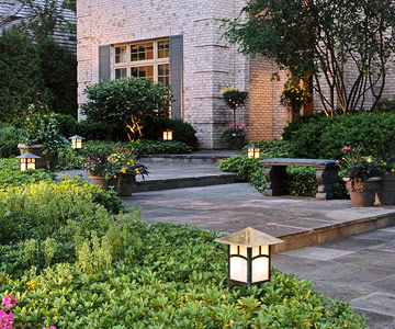
What could be more lovely than early morning or evening in the garden, when plants virtually glow from warm backlighting? Who can deny that light gives plants life?
Light and shade change the way colors look and how they work together. Although you can't control natural light, you can play up its effects. Bright light has the same impact as warm color -- it advances visually, making an object or area feel closer than it really is.
Keep in mind that light can be either natural or artificial. It is easy to add a low-voltage lighting system to extend your garden enjoyment into the evening hours. Various fixtures and their positioning create different effects. Frontlighting a dark area highlights a particular feature. Backlighting silhouettes a sculpture, tree, or shrub. Sidelighting, which can also produce dramatic effects, is used mostly for safety along walks and paths.
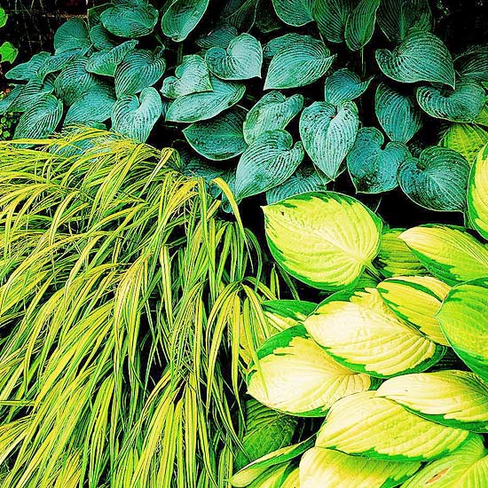 Combine a range of fine-,
medium-, and coarse-textured
plants to achieve balance and a
bit of drama.
Texture evokes emotional responses. Both tactile and visual textures invite you to touch. Use texture to contrast plants in groups or minimize architectural lines.
The characteristics of texture divide plants into three basic groups: coarse, medium, and fine. Coarse-textured plants, hardscaping materials, or garden structures have large or boldly tactile components, such as the leaves of rhubarb or an arbor made with rough-cut 8x8 posts. Fine-textured materials include many ferns and grasses or a delicate structure such as a bent-wire trellis or arbor. Medium textures fall in between.
Changes in texture can be subtle; the textures of various plants (and objects) are relative to one another. An ornamental grass, when viewed alone, may seem a fine-textured plant. However, when compared with zoysiagrass, which is much more finely textured, it may appear more coarse-textured.
You'll find lots of textures -- smooth or prickly, ripply or frilly -- and endless ways to combine them to achieve repetition, contrast, balance, and unity. All are found in a successful garden.
Often, the textural appeal of plants is found in their leaves. Dainty-leaved plants make a staccato of dots; grasses, irises, and daylilies paint pleasant, smooth stripes. Smooth hostas paired with astilbe's feathery flowers and serrated foliage make a classic combination.
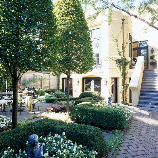 Trees and shrubs can take many
forms. A good home landscape
includes major plants with two
or three contrasting forms.
A landscape without strong, contrasting forms becomes as confusing as a melody without rhythm. The form and shape of plants and other objects in the garden work to divide space, enclose areas, and provide architectural interest. Grouping plants displays their shapes and creates various effects.
Round forms, such as boxwood or barberry shrubs, for instance, add definition and stability to a mixed border. A series of mounded forms creates an undulating rhythm.
Repeated, narrow verticals also add stability. Alone, an upright arborvitae or a thin cactus looks awkward. Clustered, they appear well-placed. The strong uprights of a fence add a sense of security and completeness.
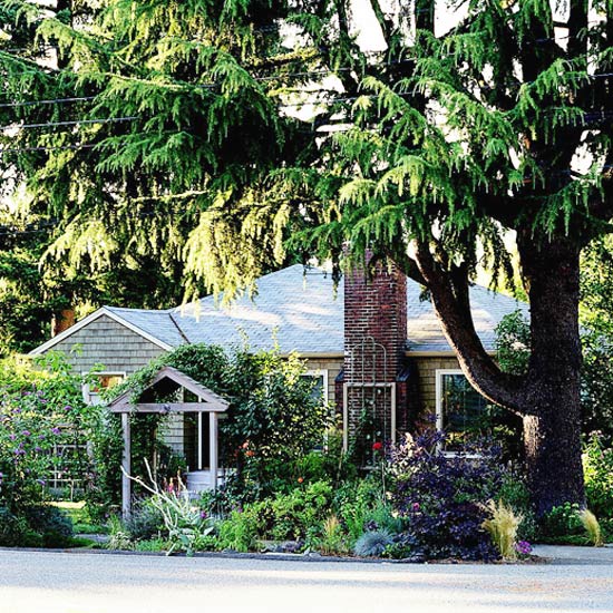
Scale, or proportion, is the size relationship of one object to another. A 30-foot tree is out of place in the middle of a small patio, but a dwarf tree makes sense. Conversely, a massive house overpowers a narrow front walk lined with strips of flowers.
Consider the ultimate size of a tree before you plant it. The most beautiful tree in the world will look awkward and out of place if it towers over the front of a house. That same tree, if placed in the back yard, may provide a pleasing frame for the house.
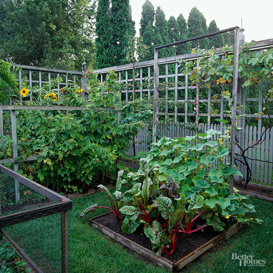
Pattern is the repetition of shapes in order. Pattern creates rhythm, as well as charm. It reinforces texture and contrast. When creating patterns, think of light and shadow as part of the palette. Use pattern to draw attention to an area; be careful not to overdo bold patterns, which can overwhelm. Also apply this principle when creating backgrounds. Lay a brick herringbone pattern in walkways, patios, entryways, and driveway borders to unify your hardscape, for example. Employ pattern as a way to direct people through the garden too.
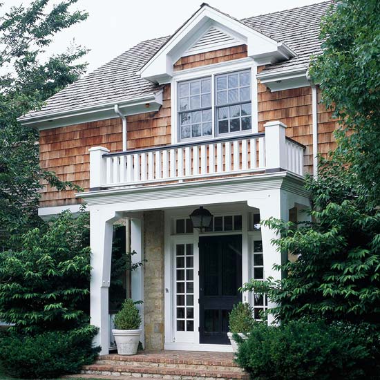
Visual balance is achieved when the elements on each side of a real or imaginary axis are equal. If too much emphasis is placed on one side of the garden, your eye will be drawn more readily there and not to the garden as a whole.
There are two basic types of balance: symmetrical (formal) and asymmetrical (informal). When establishing balance, you need to determine a central reference point from which to draw an axis. It could be the front door, a tree in the backyard, or any other object.
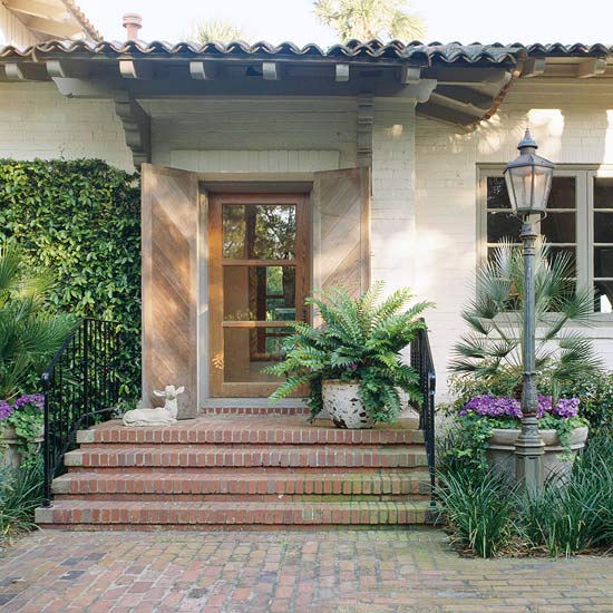
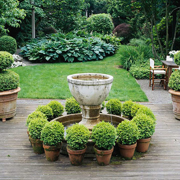
Symmetrical, or formal, balance is the easiest to see and understand: The elements on either side of a real or imaginary line are mirror images. The pool garden below is a good example of this kind of balance.
Formal balance doesn't always suit a home or garden style. You may prefer informal, or asymmetrical, balance. For example, a large tree on the left can be balanced by three smaller ones on the right. Or a large mass of cool colors on one side can balance a small mass of hot colors on the other side.
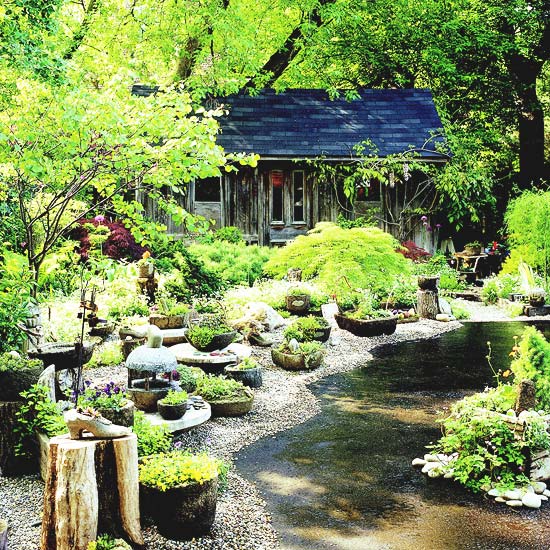
Unity results when all of the basic garden design principles come together in a balanced, harmonious whole. Focusing on harmony will help as you choose from an exciting and sometimes bewildering array of plants and other landscaping materials.
Make simplicity a guidepost as well, and you likely will achieve a unified design that gives you a sense of completeness. Good structure in the overall design, combined with hardscape that meets your needs for service and enjoyment, creates the perfect setting into which you can place favorite plants -- trees, shrubs, groundcovers, flowers, and seasonal containers.
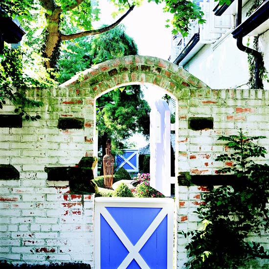
Contrast emphasizes the difference between a plant or an object and its surroundings. Using contrast is the best way to avoid predictability in a garden. It also adds a pleasing sense of tension between elements. Like most garden design principles, in moderation contrast is good, but too much can be confusing and unrelaxing to the eye.
You can create contrast by manipulating various elements such as form, texture, and color. Achieve a distinctive look by planting the contrasting forms of horizontal 'Bar Harbor' juniper in front of red-twigged dogwood, for instance.
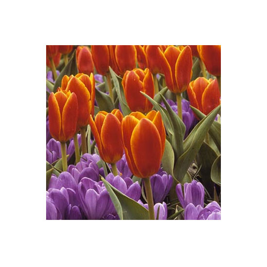
You can contrast textures by varying hardscaping materials, such as bricks and gravel, or plant textures, such as a leathery leaved magnolia next to a finely needled cedar or juniper shrub.
Finally, the colors of flower blossoms can create wonderful contrasts. To be most effective, the hues should be widely separated on the color wheel. For example, red and green, purple and orange, and yellow and blue represent the highest contrast in color. You can also contrast variegated leaves with solid colors, or green and purple leaves.
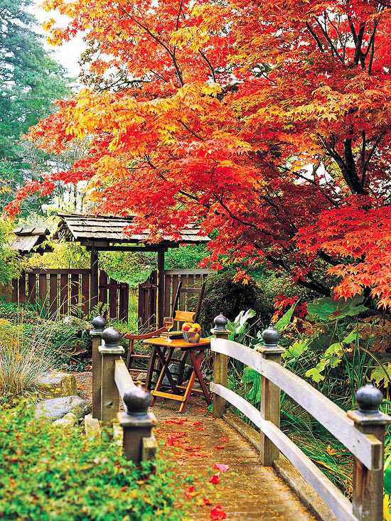
Color seduces the eye, evokes mood, and reflects the seasons. As a powerful and unifying tool, color has predictable effects. Cool blues, purples, and greens soothe and recede, whereas warm reds, oranges, and yellows enliven and advance.
Single-color schemes enchant with their simplicity. The real fun comes in expressing your personality by combining colors. Some colors compete for attention; others harmonize.
Although flowers are the jewels of the garden, too many different colors look chaotic. Remember that a balance of subtly different colors creates a pleasing effect.
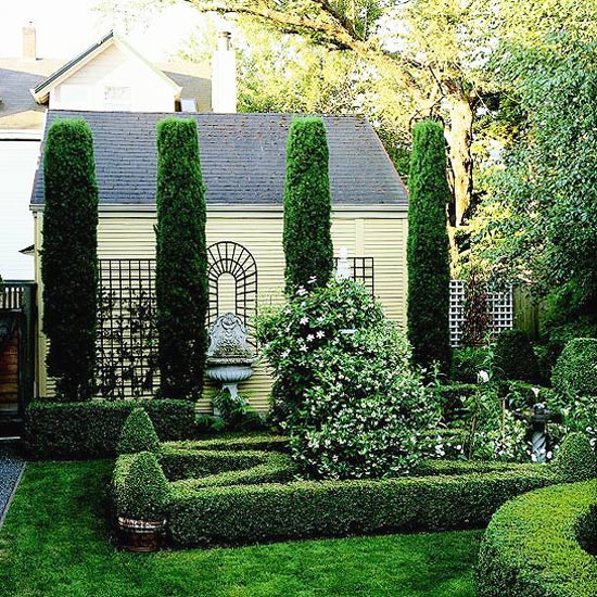
Rhythm and repetition come about when you correctly position or contrast features. Rhythm avoids monotony.
Gardens that may be complete in almost every sense may seem ordinary until rhythm is introduced -- for instance, a stately procession of shade trees along a drive or the reptetition of pavers or the pickets in a fence. These elements create a clear sense of movement.
Rhythm doesn't necessarily require literal repetition. It may be achieved by the use of line. The path shown here undulates with similar -- although not exact -- curves. In addition, the consistent use of the vertical lines of the bamboo helps create a sense of rhythm.
Another example of rhythm is the gradual change along a planting bed of warm colors and coarse textures to cooler colors and finer textures, and then back to warm and coarse. As different plants come into bloom and then recede, to be replaced by others, there will still be a satisfying sense of visual rhythm.
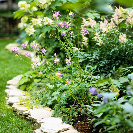
Just as you choose your guests for a dinner party with concern for their interests and personalities, so can you combine a variety of plants for compatibility.
Accents and focal points serve to make a landscape more interesting. Use them sparingly, however, to maximize their individual impact. Often, a single, interest element added to an otherwise drab scene can make all the difference.
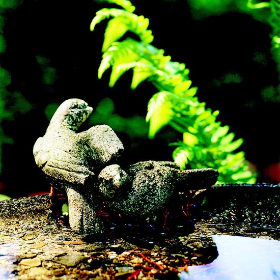
Similar shapes and colors reinforce a theme. But certain focal points, by virtue of their interesting character, deserve major attention. These focal points should stand out from the rest of the garden. Occasional accents, such as an arbor, a sculpture, or a specimen plant, help create balance in a garden between the reference points and the background.
Copyright © www.100flowers.win Botanic Garden All Rights Reserved