There are many alluring garden destinations that comprise my horticultural bucket list. Last month I checked the Royal Horticultural Society’s Chelsea Flower Show off that list for the second time
. (My husband sent me to see Chelsea as a surprise birthday gift 11 years ago.) Arguably the best flower and garden show on the planet, the RHS Chelsea Flower Show attracts the who’s who of horticulture. Landscape architects, garden designers, plant breeders, Her Majesty Queen Elizabeth II — they all show up. I even had my own Prince Harry sighting!
After spending a day studying the perennials, annuals, grasses, bulbs, trees and shrubs (see my story about Chelsea’s great planting ideas) and reporting on the Chelsea 2015 winning show gardens, I returned for day two. That’s when I zeroed in on the best ideas for outdoor living. From the grand concept to the minute details and subtle gestures, the creative displays have much to teach about how one can live beautifully in the garden. Artfully designed and expertly constructed, the gardens demonstrate all sorts of potential for landscapes small or large. Here are some of my favorite new outdoor living ideas.
Debra Prinzing
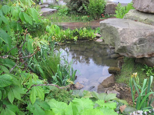
Naturalistic ponds. Designer Dan Pearson’s Laurent-Perrier Chatsworth Garden pays homage to the trout stream on the great Chatsworth estate, where nature has the upper hand.
I love how authentically his small pools appear timeless and rooted, as if no human were involved in the creation. To achieve this look, Pearson lined a shallow pool with native stone found at Chatsworth. He softened the margins at the water’s edge with riparian plants known to naturalize along streams and creeks.
Among other moisture-loving plants, Pearson chose the small, grass-like
Luzula nivea;
several ferns, including
Dryopteris filix-mas,
Osmunda regalis and Matteuccia struthiopteris;
the rush-like
Juncus effusus;
and
Iris pseudacorus.
Debra Prinzing
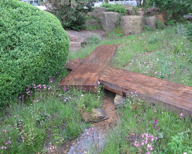
Deck-style pathways. In another view of Pearson’s reimagined Chatsworth landscape, there are narrow footpaths as well as sturdy wood planks doubling as walkways.
Installed deck-like, at grade, and connected like two puzzle pieces, these path sections provide a safe crossing where the ground is muddy or wet. It seems thoroughly translatable to the scale of a residential garden, although keeping the boards free of slippery moss is advised.
Debra Prinzing
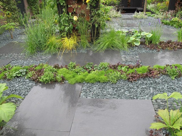
Mixed media. I fell in love with newcomer Sean Murray’s design for a would-be couple nearing retirement with a goal of downsizing to a lawn-free yard. This garden was not judged like the other creations, because Murray won his place at Chelsea after participating in a joint BBC TV/RHS televised design competition called The Great Chelsea Garden Challenge. (That’s also the title of his garden.)
A 52-year-old nurse, Murray collaborated with a veteran contractor and a nursery owner to execute the design. I love his reliance on fine gravel, crushed slate and honed pavers to create a monochromatic, patterned “carpet” into which are planted grasses, ground covers and succulents.
The purpose: to control stormwater runoff. The result: a gorgeous tapestry that looks far better than a lawn.
Debra Prinzing
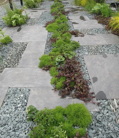
Planted driveway. In another view of the patterned paving treatment, the arrangement of larger cut stone slabs starts to make sense. Here, by using an alternating placement of vertical and horizontal pieces, Murray ended up with two mostly solid bands that could accommodate the wheels of a parked car. He did so without making this section of the garden look like a driveway. Low-growing plants that are happy rooted in gravel soften the stone bands.
Debra Prinzing
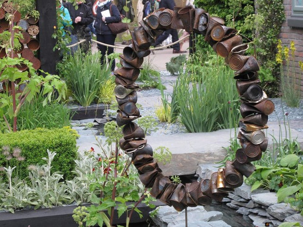
Recycled artwork. This sphere of crushed tin cans gets my prize for the most innovative use of repurposed household junk, transformed into contemporary garden art. Murray used the humble material creatively throughout his garden installation.
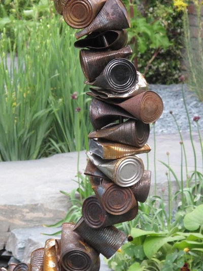
I took one look at the ring of cans and thought, How to replicate? Start with a perfect ring of thin, smooth rebar (check metal yards for industrial sources). Collect dozens of cans from everyday kitchen projects. Peel off the labels and smash each can flat. Using a bit suitable for metal, drill a hole in the center of each can. String the cans onto the ring. Mount or suspend the finished piece in the garden and let it rust naturally in the elements.
I know this is all probably easier said than done, but there’s something so simple about Murray’s piece that I want to give it a try!
Scroll down for more images.
Debra Prinzing
Tin can detail. Here’s a closer view of how each piece is “strung” onto the metal bar, similar to threading beads onto a cord.
Debra Prinzing
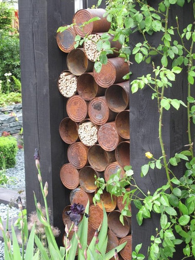
Urban habitat. In another section of the The Great Chelsea Garden Challenge display, Murray stacked tin cans to create an artful and useful habitat tower for pollinators. The openings are filled with hollow pieces that are ideal for small bees to nest in.
And just like with the tin can sculpture, this reuse of an easy-to-find material captured my imagination.
Debra Prinzing
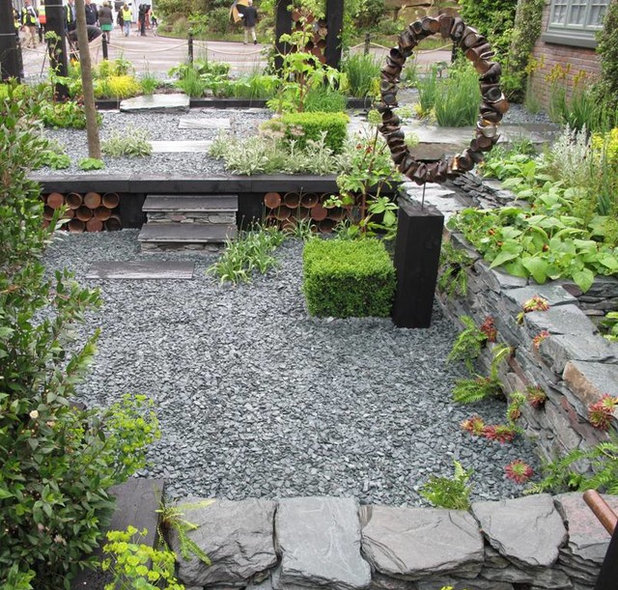
Change the grade. Murray’s design for a multipurpose front yard is made more exciting by this “sunken living room” treatment. The change in levels emphasizes a secluded area for solitary or social gatherings, screened at left by shrubs and small trees.
One could imagine that within the gravel-carpeted space, accessed by a few steps, plants and people would be protected from street noise and out of view from passersby. The dry-stacked stone wall encloses the sunken patio and doubles as garden seating.
Debra Prinzing
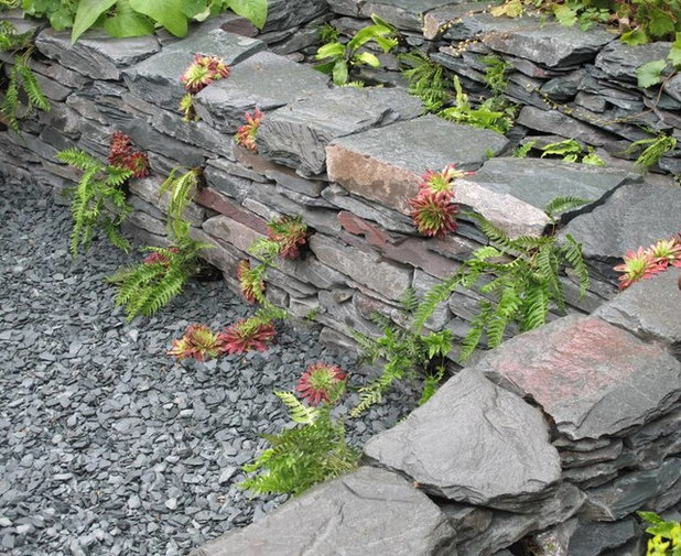
Tuck in plants. Here’s a detail of the slate dry-stacked wall that defines Murray’s sunken garden area. Hardy succulents and sedums are the ideal choices to plant in natural nooks and crannies formed by gaps between the stone.
Debra Prinzing
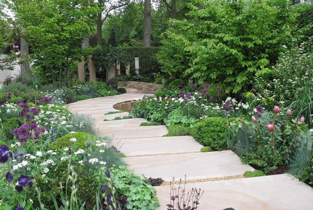
Pathways for two. Good landscape design accommodates the navigation of humans through a garden space, and that means two people walking side by side. This oft-shared rule is at play here, in The Time in Between, by Australian designer Charlie Albone for sponsors Husqvarna and Gardena.
The beautiful sandstone pavers, quarried in Australia for this installation, are nearly 36 inches wide. The generous path circumnavigates the evocative display garden, which Albone designed as a space to tell his late father about his life since the elder man’s death. It’s easy to envision father and son taking a walk here, side by side, to have that conversation.
Debra Prinzing
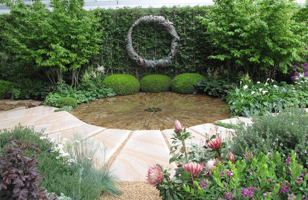
Iconic forms, repeated. The circle is an important motif to Albone, as seen in this view of a water feature as the central focal point in The Time in Between. The designer wanted this space to be calming and serene, a place where visitors could reflect and meditate.
The circular form is powerful, as seen in the pool of water, the curve in the path and the abstract metal sculpture. The clipped shrubs lined up beneath the sculpture repeat this shape to great effect.
Debra Prinzing
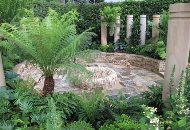
Enclose for intimacy. Albone’s use of Australian sandstone throughout his display garden unifies each of the distinct areas.
Nowhere is it more effective than here, in the semi-hidden seating area that is enclosed by stone and foliage plants. The circular space symbolizes for the designer his connections with friends and family. A series of sandstone pillars (each of which represents a loved one) are located around the perimeter to suggest a protective wall.
The round fire pit at the center reinforces a sense of safety and comfort.
Debra Prinzing
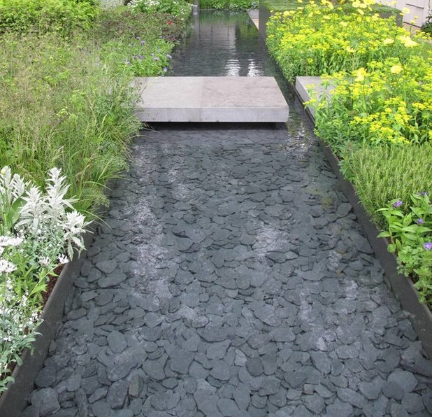
Water pathways. For The Telegraph Garden, Marcus Barnett’s design was inspired by the De Stijl movement, a group of Dutch architects and artists known for simplifying visual composition to the vertical and horizontal. In addition to planting color-themed bands and squares that fit together beautifully, Barnett installed a liquid band to flow from end to end across the garden.
The visually arresting feature is contained in a shallow, recessed runnel. It is lined with dark stones to better reflect the surrounding plants as well as the sky. The graphic treatment makes this water feature refreshing and modern. Note how the walkway is suspended over the water to ensure safe crossing.
Debra Prinzing
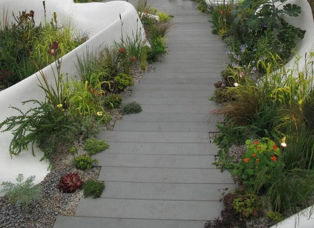
Permeable walks. Designer Fernando Gonzalez created a striking contemporary garden for sponsor The Pure Land Foundation, using cutting-edge techniques, materials and plantings.
The eye-catching walkway was created with precut stone bands that have enough spacing to allow water to seep through rather than flow away from the garden. The contemporary silver-colored sandstone, smoothly cut to create linear paving, was fabricated by Stonemarket, a British supplier of landscaping materials.
Debra Prinzing
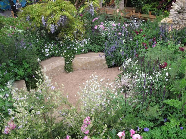
Intimate seating. RHS Chelsea Flower Show sponsor M&G Investments tapped designer Jo Thompson to create The M&G Garden, her interpretation of a writer’s getaway, complete with a two-story structure in which to work, a large natural swimming pond, lots of shade trees, and soft plantings of perennials and grasses.
Tucked away in one corner of this thoroughly romantic space is a whimsical seating area that captured my imagination. The tumble of perennials, herbs and roses encircles a diminutive circle where stone benches encourage one to rest, write, sketch or just contemplate nature. Small is indeed better here — a secret place in the midst of an expansive garden.
To replicate this feature, one would need just a few solid blocks of stone (even a tree stump would do!) and some fast-growing perennials to hide the spot from view.
Debra Prinzing
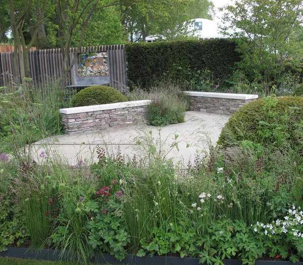
Diagonal drama. The Cloudy Bay Garden in Association With Vital Earth was designed by landscape architects and brothers Harry and David Rich. Much of the display is devoted to entertaining, including this patio, where low walls both define the space and provide seating. I am impressed by the designers’ choice to place the walls at an angle rather than use the more predictable option of edging the patio’s perimeter.
The diagonal device increases the dynamic tension of this garden, making it more interesting to view and to spend time in.
More:Great Garden Ideas From the 2015 Chelsea Flower Show
See Winning Gardens From the 2015 Chelsea Flower Show


