Imagine you're the landscape architect for the highway department. You're stuck for ideas for a new stretch of the interstate, so you click your browser shortcut, head over to Houzz and land on a cute-as-a-bug's-ear window box arrangement.
Warning! Assuming the traffic engineers have done their job, the typical viewer would buzz past a window box planting at a mile a minute. What are the odds anyone would appreciate that brilliantly conceived combo of chartreuse coleus cleverly paired with luscious lipstick-red canna lilies and accented with a burst of silvery oat grass?
Only so much visual information can be absorbed at one time. This idea applies not just to highways but also to backyards, where the viewer is sitting on the terrace looking at a focal point bed 100 feet away. With a little foresight and planning, you can create the ideal landscape for every situation.
Elements Landscape
When designing for curb appeal on a residential street, chances are the person you're hoping to impress is cruising past at 20 miles per hour, meaning there's about five seconds to take in your handiwork.
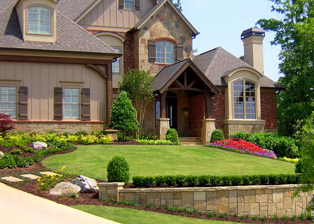
The designer of the garden shown here demonstrates a strong understanding of how scale affects composition. The architecture is unfussy and so is the garden, which relies on a broad swath of lawn to offset the mass of the house. Only a few varieties of plants are used, and they're deployed in large groupings. Bold color is lavished at the door, visible from the street while providing an eye-popping treat upon arrival.
ecocentrix landscape architecture
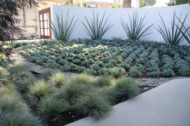
Using the same idea, but on a smaller scale, this simple three-plant combination has enough textural contrast to stand out at a distance, while featuring a monochromatic foliage palette to prevent it from overwhelming when viewed up close.
Jeffrey Gordon Smith Landscape Architecture
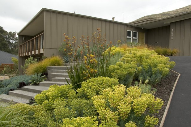
From the street, this front yard reads as a mass of yellow with splashes of silvery gray. But on closer inspection, it's a rich brocade of varying sunny colors.
Euphorbia characias wulfenii is the dominant player, supported by the taller kangaroo paw (
Anigozanthos 'Harmony') and a striking gold-tinged ornamental New Zealand wind grass
(Stipa arundinacea). The gray is a subtle duet of
Agave attenuata and blue chalk sticks
(Senecio mandraliscae).
Wallace Landscape Associates
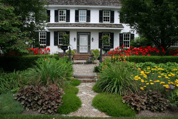
You
can have it both ways: complexity where it can be appreciated at the foot of the path and a bold punch of color (in this case red) contrasting a black and white facade. Yet even the elements of the foreground composition are rendered with bold strokes, making them easy to comprehend regardless of the location of the viewer.
Margie Grace - Grace Design Associates
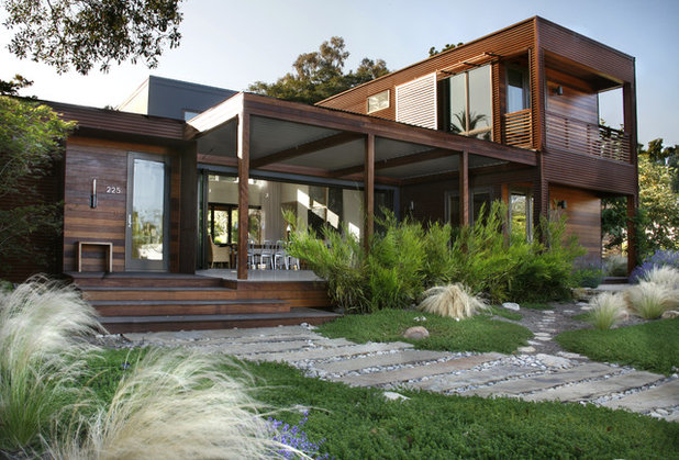
Consider the bulk and lines of the house when deciding on how busy or restful the garden should be. Bold contemporary architecture makes a bolder impression when it's not competing with a fussy landscape. Let low-lying plants create a spacious foreground, then apply restraint by embellishing the garden with a few well-chosen accent plants.
Jeffrey Gordon Smith Landscape Architecture
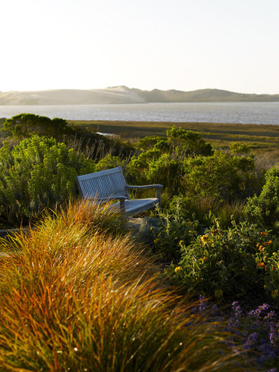
Where natural vistas take the starring role, the landscape needs to complement and frame the view. Try to mimic nature's planting approach, creating harmonious colonies of the same plant to avoid competing with the view.
Johnsen Landscapes & Pools
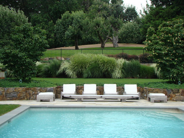
Imagine how chaotic this restful tableau would feel with a fussy flower bed as a distraction. Instead, generous dollops of
Miscanthus grass create a soft backdrop. Upon closer inspection, we see three varieties — one with near-white foliage to blend with the chaise longues — adding just enough interest to avoid monotony.
Johnsen Landscapes & Pools
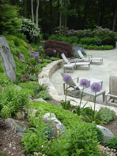
The more intimate the space, the stronger the justification to strut your planting design stuff. Feel free to poke a special plant in here and there, like arranging bric-a-brac on a family room shelf. Placing plants where you linger also invites you to appreciate a more detailed design.
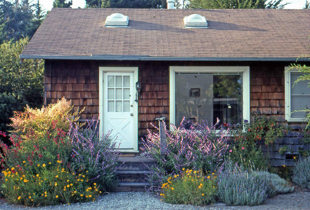
Elemental Design Group
Here's a great example of a 2-mile-per-hour garden. Upon approaching the door, someone can appreciate the fine details of this free-form planting. The simple cottage architecture is perfectly paired with a rustic, exuberant array of wildflowers and perennials.
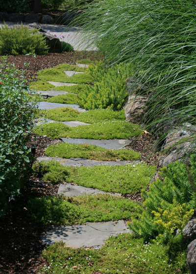
Ami Saunders, MLA
Simon and Garfunkel suggested, "Slow down, you move too fast." Informal stepping stones usually mean a slow, contemplative pace through the garden. What better place to introduce subtle plays of foliage and texture? This shift in scale, from broad brush to intimate detail, makes a trip through the garden a richer experience.
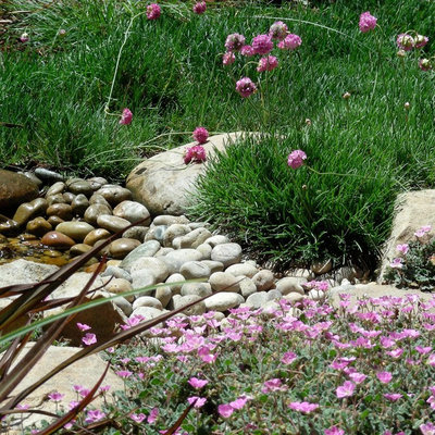
Billy Goodnick Garden Design
Time to hit the brakes, slowing from 2 miles per hour to getting down on your hands and knees to appreciate the simplicity of this combination. Pink is the harmonizing element. Contrast comes from pairing floating puffballs of pink sea thrift
(Armeria maritima), but maybe it should be renamed
Horton Hears a Who plant, perched above grass-like foliage, with pink cranesbill (
Erodium x variabile) in the foreground. A vignette like this can only be appreciated up close and personally.
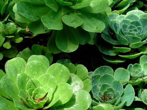
Billy Goodnick Garden Design
Zooming in even closer, consider using two plants with nearly identical forms (foliage arranged in simple rosettes) and exploiting the subtle differences of their scale and leaf color. From a few feet back, the slightly larger, yellow-green Aeonium and blue-grey Echeveria blend together into a single mass. But these chubby little drama queens add an extra dose of charm to the garden when we slow down and admire them.
Houzz gardening guides: What to Do in Your Garden Now


