Be it a grouping of ornamental trees or a fountain, a focal point is often displayed at the heart of a garden, lending a sense of importance or a calming balance to the design. Focal points lend order to chaos. They define a place for the viewer to look. They turn a vast, panoramic scene into something more intimate.
In any garden, large or small, the idea can be successful because it borrows heavily from fine art, interior design and architecture. Less may be more in choosing a focal point. For example, a scattering of flower pots pales in comparison to only one significant, beautiful urn. Similarly, a specimen tree planted at the terminus of a path is compelling and so much more interesting than a mass of prosaic shrubs.
Look at your garden environment critically, and the obvious "bare spots" may cry out to you. One technique is to photograph a scene in black and white. The tonal image is easier to dissect, and you can zero in on where a piece of sculpture should be placed, or where a gorgeous tree should be added.
Get focused and find the best focal point for your garden. Here are some great examples.
Ann Kearsley Design
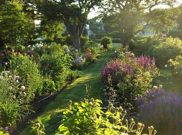
Subtlety in the midst of abundance. A focal point can be a quiet punctuation point, like a period at the end of a line of poetry. For example, this gregarious double perennial border defines the landscape. But the exuberance of color is offset by a grassy strolling path that leads to a small but effective focal point.
Notice the shrub at the end of the path, centered between two huge shade trees. This detail creates a natural end point of the perennial garden and can be appreciated from a long distance away. Imagine how the setting would look without this modest focal point, and you'll understand how valuable it is.
Wagner Hodgson
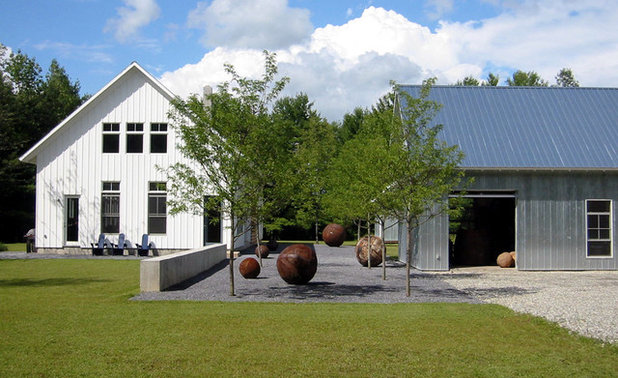
Use negative spaces wisely. The flat void between these two buildings might have been a place to park the car or stash waste and recycling bins. But now, in the hands of a gifted designer, this opening contains a collection of botanical and man-made elements. Together they create a focal point that makes the entire landscape feel cohesive.
I love the interplay between the bosk and the various-size metal orbs on the ground. I love how the gaps between the tree trunks and the artwork can be navigated so anyone visiting walks through the space (rather than just observes it). This space is modern and understated — but certainly makes a powerful design statement.
BERGHOFF DESIGN GROUP
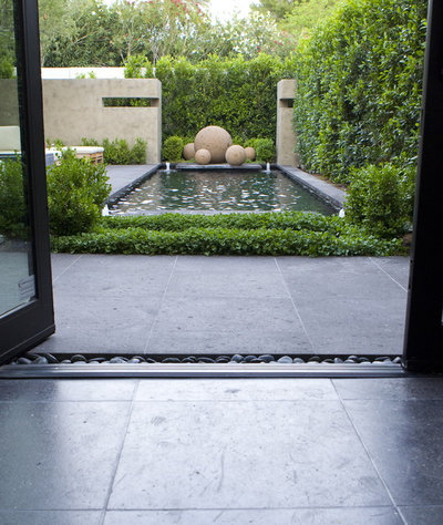
Draw the eye. Everything is perfecty aligned on the axis that connects this open doorway with the perimeter hedge. You can see where the notion of a framed view works hand in hand with the idea of a focal point. That's because the grouping of terra cotta–colored spheres is nicely framed by every other element of this installation.
First there are open glass doors, which link interior and exterior spaces. Next there's a stone patio, which draws the eye further, across the low hedging, over the water's surface and between two accent walls that create a gallery-like niche for the orbs. This technique works well in narrow spaces, adding perspective and creating a pleasing sense of proportion.
Harold Leidner Landscape Architects
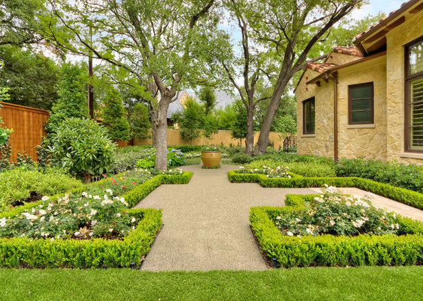
The destination is the journey. Formality doesn't have to be stuffy, especially when you give it a beautiful focal point. In this Mediterranean-inspired parterre, detailed planting beds (outlined in low boxwood hedging) define each quadrant. There is plenty of space devoted to a generously scaled walkway of decomposed granite that runs through the center of this garden.
And while you will want to take a walk here, you are given specific clues about the direction to take, thanks to an ocher-glazed urn placed at the center of the path. How nice that four live oak trees were already in place to flank the urn, creating a hard-to-ignore destination in the garden.
Westover Landscape Design, Inc.
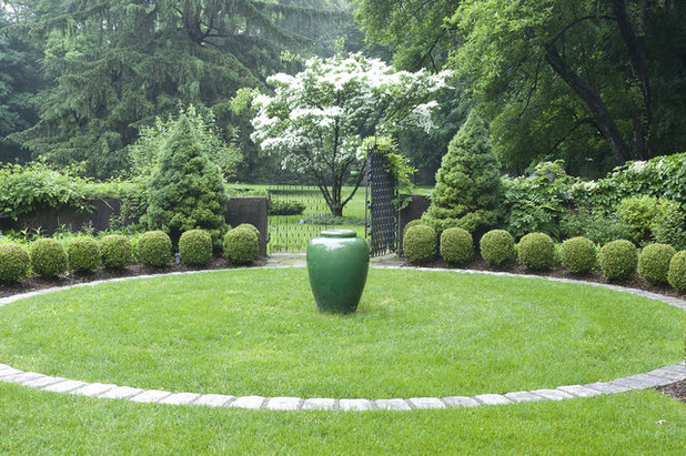
A circular focal point. I love this study in green, with a single accent of white from the flowering dogwood tree. Rather than using linear elements to draw the eye toward the focal point, the designer placed the focal point at the center of a circle so that everything flows outward from that lovely jade green urn.
This design technique is inspired by radial balance, much like the spokes of a wheel or the ripples that occur when a pebble is dropped into water. The strong visual impact of rounded forms — the lawn, the curved band of stone, the clipped boxwood balls — encircle the central focal point and makes this garden feel restful and serene. Simply sublime!
Ehrlich Yanai Rhee Chaney Architects
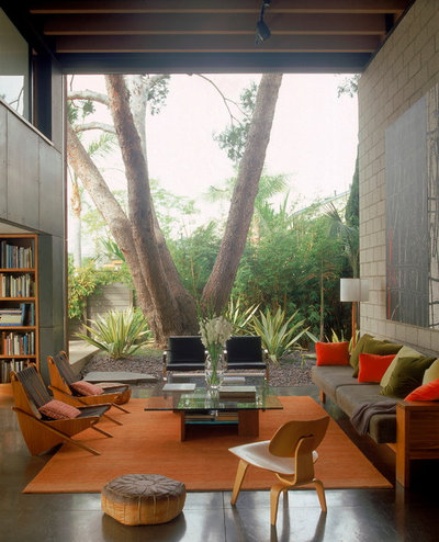
House, meet tree. There is nothing demure about this focal point. It is a massive, multitrunked tree that is revealed through an exposed wall in this incredible indoor-outdoor living space. The surrounding frame, formed by side walls, ceiling and floor, makes for a scene as compelling as a theatrical stage with the curtains pulled back. On that stage is the garden, with the beautiful tree front and center to create a living, breathing, vibrant mural.
Not everyone has the budget to undertake such a design, but think about how your porch can frame a focal element in the garden, and you'll achieve a similar effect.
Pat Brodie Landscape Design
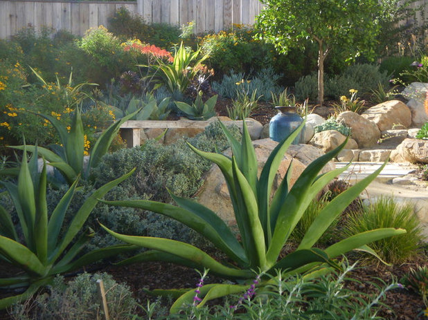
Three-dimensional focus. The dynamic placement of large, sculptural agaves has turned this small condo garden into a terraced vignette worthy of admiration. Rather than a single work of art or a tree being used here, a dominant shape (over and over again) lends a point of view to the landscape.
The blue-green tone of the giant succulents is also repeated in the ground covers, smaller agaves and vivid blue urn, carrying the narrative along to a beautiful conclusion.
Randy Thueme Design Inc. - Landscape Architecture
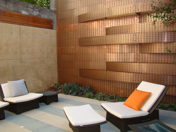
Accentuate the positive. Like interiors can benefit from accent walls, the garden can certainly benefit from a strong vertical design element, like a wall. Perforated strips of copper have been installed in a horizontal pattern to create a dimensional panel at the edge of this patio. It serves as a work of art, a privacy wall and a major focal point in the garden. Because the rest of the palette elsewhere is mostly black and neutral, the copper takes on a warm glow that infuses the space with interest, character and a point of view.


