“I know it when I see it.” Are you familiar with that saying? When it comes to art, furniture, film or wine, we don’t always find the right words to explain what moves us. Yet we do get an indescribable sensation when viewing a pleasing object or tasting perfection on the palate, and those moments are unforgettable.
Undoubtedly, most design projects begin with that goal: to create an environment where we feel at ease, safe and nurtured. To me, the landscapes that achieve these objectives are ones that convey a true sense of place. And yet that is a fleeting dream for many prosaic spaces.
It doesn’t have to be that way. And having a big budget isn’t always the secret.
A sense of place in the garden is achieved when our senses are enlivened, when we feel at home, wherever that home is. These eight designs show some ways to create that feeling in your own personal landscape.
Lori Smyth Design
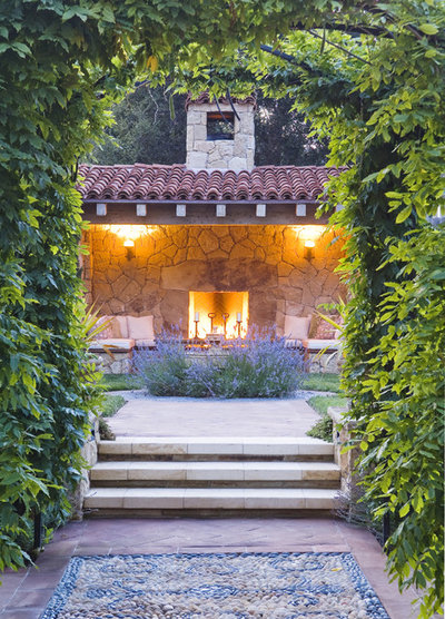
1. Give it home-like elements. There's everything to love about this outdoor room: The obvious "doorway" through which one enters (complete with a stone mosaic "area rug" at the threshold), the steps that ascend to a welcoming outdoor room, the presence of aromatic lavender to stimulate sensory memories, the shelter of a roof overhead and the warmth of the fire in the hearth.
Exquisitely appointed, this garden has a distinctive point of view. Once you settle in, leaving would be unthinkable!
Jeffrey Gordon Smith Landscape Architecture
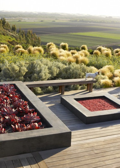
2. Capture vistas and vignettes. Modern lines, materials and plantings abut this semiwild, meadow-inspired grass hillside. This scene offers a beautiful, inwardly focused point of view. Yet the distant landscape is equally powerful, a living work of art that is ever changing.
For anyone who sits here, the vista is as much a part of the design scheme as the deck, the bench and the raised planters. It is a set piece composed with intention — a gift to those who come seeking the healing power of nature.
Lankford Associates Landscape Architects
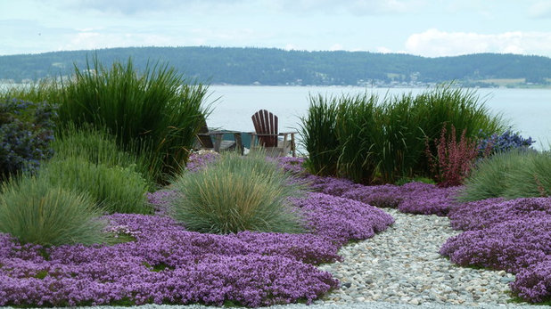
3. Create a beautiful approach. I love the partially hidden aspect of this beachy seating area. Lots of gardens have two strategically placed Adirondack chairs, but rarely has this familiar pairing been so alluring. An opening in the tall grasses offers a glimpse of the seating area — a safe promontory at the edge of the sea.
Sense of place is amplified by the crunchy pebbled pathway, the soft mounds of grasses and ground covers that encroach on either side, and the pleasing knowledge that one will soon gaze upon the water at the end of this journey.
debora carl landscape design
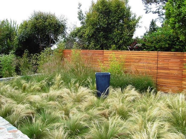
4. Elevate the ordinary. A single object, a dark metal planter that one might easily find at a garden center, is suddenly treated as a work of art. Mexican feathergrass
(Stipa tenuissima) adorns the garden floor like a plush carpet, while a simple, streamlined fence forms a gallery-like wall that defines the space.
Without the pot this area of the garden would lose its sense of place; with it there's a powerful point of view. The pot is a surprising focal point here — It looks stunning against the glowing grass at its base.
1800Lighting
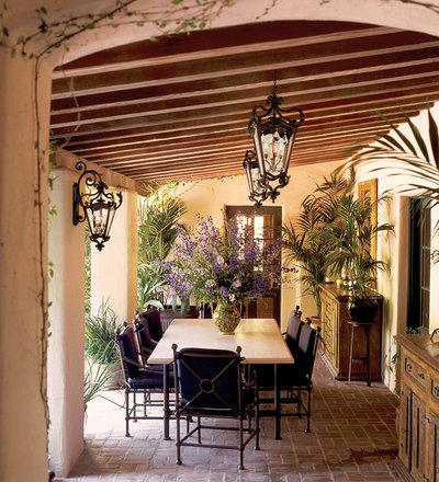
5. Use scale for impact. A breezy, covered dining area is a plus for any home or garden, but this one gets high marks for its bold accents. Upon entering, there is no doubt that it's a unique, highly personal space in which to dine and certainly to linger.
The special pair of lights hung from the overhead rafters and their companion sconce mounted on a column are grand in scale and elegant in detail. The tropical plants, placed strategically to soften the home's stucco exterior and lend garden-interest detail, complement the lighting. The vase of flowers has a similar scale, connecting visually with the lighting overhead and the graphic fronds around the room's perimeter.
Amazon
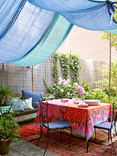
6. Luxe it up with layers. You may think this scene is the last one that I'd describe as luxe, but even though this outdoor dining space is modest and decorated with simple lengths of fabric, it has a true personality — creating a sense of place for those who come here.
Why it works:
• Draped canopy: Panels of fabric (possibly several repurposed drapes, shower curtains or sheets) were stitched together and suspended to create a casbah-like roof overhead.
• Fanciful flooring: Outdoor area rugs soften the floor and add a jolt of color.
• Table talk: The small café table is the center of attention here, its patterned cloth echoing the blues and reds used elsewhere.
• Pillows, pillows, pillows: The ordinary bench became a chaise with some comfy cushions tossed on.
Cornerstone Architects
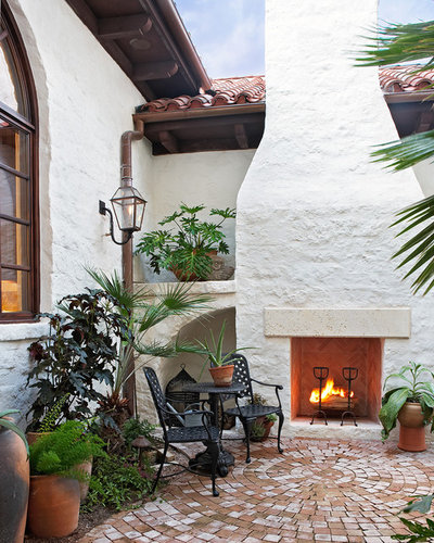
7. High style plus high function. This lovely outdoor fireplace and courtyard are certain to draw attention from humans in search of the warmth and comfort of flame. But look at the gorgeous old-brick flooring. The designer thoughtfully focused on this vast surface area and gave it a strong role to play in the seating area.
The bricks form concentric circles, with the center aligned perfectly with the fireplace. Radial symmetry is at play here — and it is like a powerful bull's eye. The floor could have been finished with the expected row upon row of brick pavers, but instead it's both functional
and decorative. You can't take your eyes away!
Secret Gardens
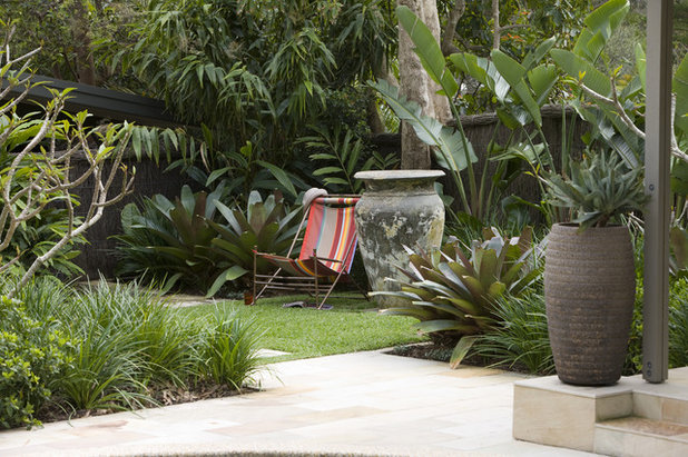
8. Less is often much, much more. The word "uncluttered" comes to mind for this grassy nook. One Ali Baba–scale urn plus one simple, striped awning chair, and all of a sudden the space has a point of view.
The urn feels permanent, anchoring the base of a tree trunk. The chair is less so, but that's part of its charm. Plunked down here for a moment, the chair turns a lush, tropical setting into a room — something to be visited and occupied, rather than just observed. (Imagine an outdoor dining table plus six chairs instead and you'll see what I mean. They would dominate the space, making it impossible to view the plantings). I like to imagine having this space all to myself, thank you very much!


