The garden, just like life, is all about balance. When is there just enough going on, or too much or not enough? When it comes to choosing and siting art in the garden, balance becomes even more important. The key is to select the right piece and place it tastefully in a spot that enhances but never overwhelms. Here are some tips to take the fear and apprehension out of the process.
Jay Sifford Garden Design
Types of Garden Art
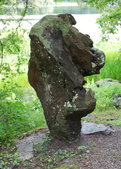
Found objects. It’s said that nature is the best artist of all. Occasionally, found objects surpass created art as the perfect piece for a garden venue. This boulder, sited in Innisfree Garden in Millbrook, New York, has the regal appearance of a lion. Unpredictably set on end, it takes center stage along a rustic path.
Displaying commonly found objects in new ways can elevate them and cause us to take second look. Don’t overlook the mundane; instead, seek ways to raise that special find to art status.
For Garden Drama, Consider the Lowly Boulder
The Collins Group/JDP Design
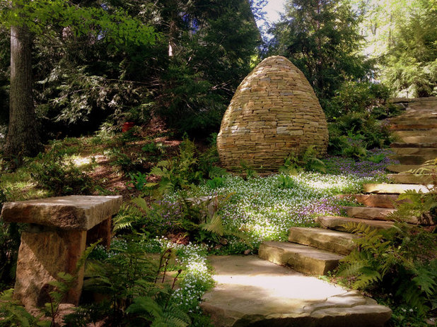
Built objects. Constructed objects, sited and themed appropriately, can make a good garden great. Cairns, such as the one seen here, historically were built as trail markers to keep people on course. Their historical purpose makes them an appropriate choice for a forest garden. Rebar, PVC and clay can all be moulded into garden art by those who are artistically gifted.
Clemens & Associates Inc.
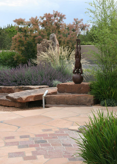
Purchased objects. Most of us will probably purchase garden art from galleries, online sources, directly from artists or even from architectural salvage yards. Pieces are available for every taste and budget, but it’s helpful to follow some important guidelines by asking yourself the following questions: Does the piece relate to the architectural style of the dwelling? Does it relate to the garden’s sense of place? Is it something that appeals to your personal aesthetic?
Kikuchi + Kankel Design Group
How to Select Pieces
Relate to existing architecture. A well-chosen piece of art pulls aspects of nearby buildings into the garden, creating harmony and continuity. Study your home for clues that will help you select an appropriate piece of art. What hues are in the home’s brick or stone? Can that blue front door be repeated in a piece of garden art? How about those black downspouts and gutters? A tall and narrow townhouse may call for an art piece that mimics those dimensions.
Keep in mind the four parameters of juxtaposition: size, shape, color and texture. Matching two of these four with nearby architecture will form a meaningful and cohesive bond.
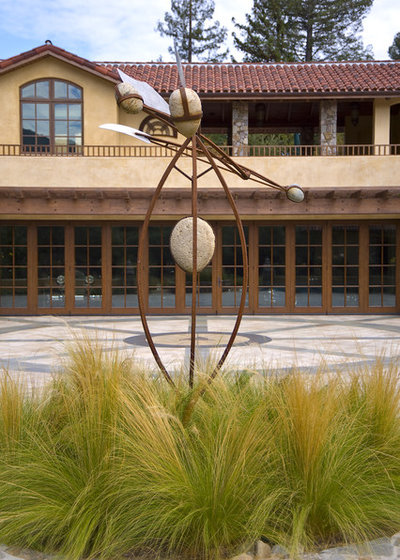
The piece shown here makes an appropriate connection with the prevailing architecture for several reasons: The sculpture’s incorporated stone speaks to the texture and color of the home’s stucco, its verticality makes a connection to the vertical windows, and the rusted hue mimics the window trim. Additionally, the piece incorporates implied movement, which is repeated in the ornamental grasses.
Jay Sifford Garden Design
Relate to the sense of place. Very few of us are fortunate enough to live in a historic district or on a piece of forested land with boulders and a stream. Instead, we probably reside in urban environments or in suburban tract homes with little intrinsic character. Searching for clues to the history of the land or a predominant industry can direct your search for appropriate sculpture.
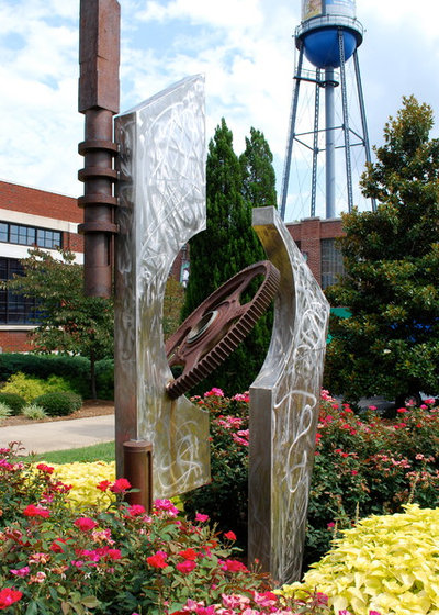
Here, an industrial sculpture speaks to the sense of place in the midst of converted warehouses. Such a piece would seem as out of place in a traditional suburban neighborhood as a sculpture featuring a pack of animals would in an urban setting.
Fine Focus Photography
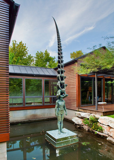
Define your personal aesthetic. Many of us are timid about selecting art because we don’t know what we’re supposed to like. The truth is that you already possess at least the seeds of a style. As a designer, I hesitate to suggest specific pieces of art to clients because tastes vary so widely. And there’s nothing wrong with that.
Keep in mind the style of your home and which attributes of it appeal to you; your favorite colors, clothing styles and vacation spots will provide a good starting point. Visiting art galleries, public gardens and sculpture parks, such as Grounds for Sculpture in New Jersey or Storm King Art Center in New York, will help you further define your aesthetic. Often you’ll learn more from what you don’t like than from what you do, because you’ll be forced to stop and analyze your reaction.
WA Design Architects
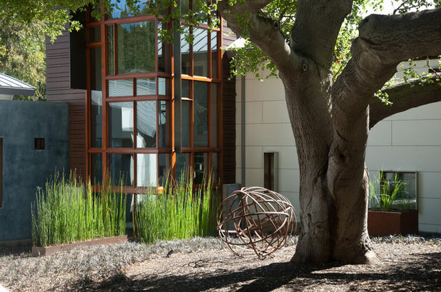
Consider scale. Choosing appropriately sized art is of utmost importance. Many homeowners undersize their art because they don’t look at the big picture and how a piece fits, or because of budgetary constraints. I’ve followed a general rule over years of observation: If in doubt, go larger by a third.
The sculptural sphere shown in this garden is sized appropriately. A much smaller sphere would go unnoticed, while a much larger one would compete with the tree. At this size, the sphere peacefully holds its own against the horsetail, also known as scouringrush horsetail,
(
Equisetum hyemale, USDA zones 3 to 11; find your zone).
David Harber
How to Site Your Sculpture
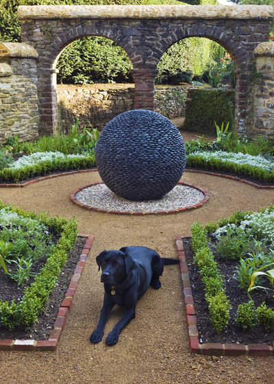
Make it a focal point. Centering a larger sculptural piece on axis with large windows or doors or at the end of a major pathway instantly creates a garden theme and draws visitors into the space. In order to successfully function as a focal point, the piece has to be able to capture attention, fuel the imagination, have an unexpected element or elicit tactile responses from viewers.
The piece shown here functions effectively in this space because its scale is appropriate to the space, its texture forms a relationship with the stone walls, its shape mimics the shape of the wall arches and the circular path, its hue causes it to stand out, and it has an element of surprise without being jarring.
Banyon Tree Design Studio
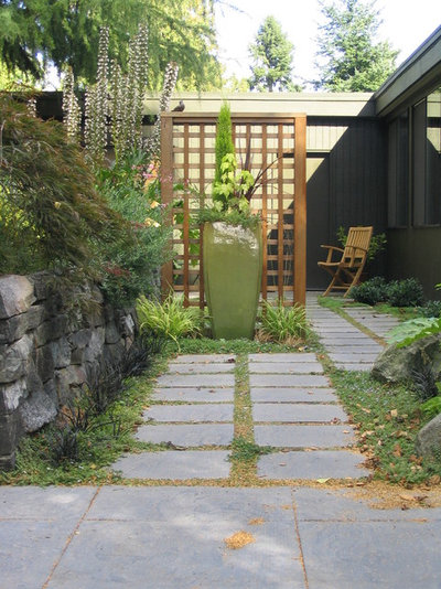
This photo shows a ceramic pot used as a focal point, sited effectively in an area where the pathway pivots. In this case, the pot on its own wouldn’t carry enough visual weight to function as a focal point, but the addition of the decorative screen brings weight to the vignette and also forms a connection with the patio furniture in the background.
Outer space Landscape Architecture
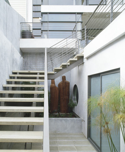
Set art off-center. Some circumstances dictate that a sculpture be set off-center. This is particularly true in small urban spaces when addressing dominant architecture or when it’s necessary to draw the eye away from an undesirable view such as a utility pole or a neighbor’s trash cans. To accomplish this successfully, the concept of asymmetrical balance becomes crucial. To understand asymmetrical balance, think of a fulcrum or seesaw. One larger child may be balanced on the fulcrum by two or three smaller children, as the weight is the same.
The sculptural installation shown here functions effectively for the following reasons: Its scale is large enough to visually balance the perceived mass of the staircase and its hue stands out against the architecture’s monochromatic white.
Bliss Garden Design
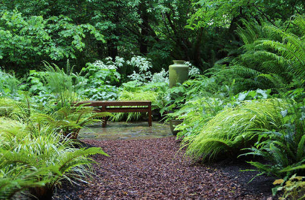
In this garden, a ceramic pot is paired with a long bench. Each reinforces the vignette: The narrow, vertical pot visually balances the narrow, horizontal bench. This design marriage results in harmony.
See the plants that make up this Seattle-area garden
Garrett Churchill Inc.
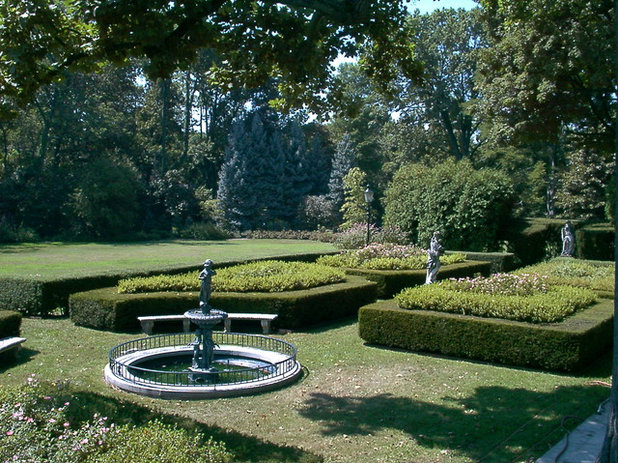
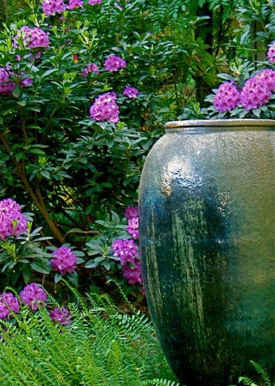
Work with multiple pieces. Incorrectly siting multiple art pieces can give the garden a cluttered, unorganized or fragmented look. If your pieces are similar and your space is large, the pieces can be arranged within sight of one another. In fact, doing so can create rhythm and pull the eye through the space, as seen in this photo.
Jay Sifford Garden Design
If your pieces are dissimilar, the most effective course of action is to site them in smaller vignettes so they aren’t all seen at once. Doing so can add feelings of seduction and mystery to the garden. Carve out niches by carefully siting shrubs, adding hedges or walls or creating curves in a path. You’ll give your visitors a sense of discovery that will linger in their minds long after they leave your garden.


