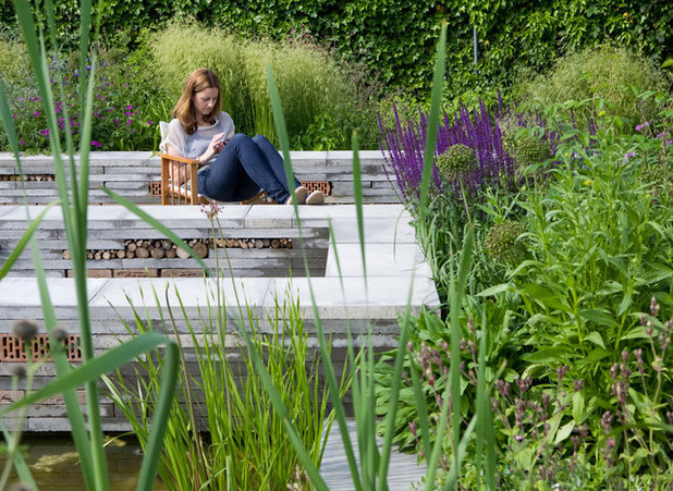
Nature is not always easy to find in the Netherlands. This is a country that was not built by appropriating parcels from the forest or meadow, but one that was largely built up from the sea centuries ago. How then do you build a garden that incorporates nature in an engaging way in one of the world’s most urban countries? For this garden in the Netherlands, Carrie Preston, principal of Studio Toop in Amersfoort, created something beautiful and teeming with nature. Her process can provide inspiration and guidance for transforming even the smallest space in the most urban setting.
Studio TOOP
Photos by Jolanthe LalkensDesigner: Carrie Preston of Studio Toop, in collaboration with Jasper Helmantel
Location: Appeltern, the Netherlands; the garden is open to the public and is part of a model garden complex
Primary challenge: This project was an assignment completed for the gardening magazine
Groei & Bloei and the television program
Vroege Vogels. Preston says that the challenge was to encourage homeowners to “green up” their small paved courtyards with a prescribed limited plant palette that would be easy to source. An additional requirement was to incorporate family-friendly biodiversity.
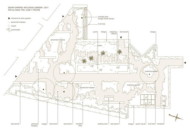
Requests: Break up a predominantly paved space, incorporate a small vegetable garden and introduce elements that are wildlife-friendly to encourage human interaction with nature. And all in a small urban space with a plant palette of 26 types and a hardscape palette of commonly available materials — to encourage people to work with what they have, Preston says.
Studio TOOP
The designer’s process. Click the photo to see more details of the site plan. Preston first explains that the Netherlands has forgiving soil and typically flat topography. The average garden space here is largely paved and averages 645 square feet (about 60 square meters). The typical aesthetic is modern with straight lines, and rectangular reflecting pools are frequently featured.
Preston thinks spatially about her designs, looking to provide an experience and to create a place for life to happen. Gardens for her are places where culture and nature meet, and the design forces a reaction from those who view it. Foremost in her thinking is this: A space without people is not a garden. This is why she almost always photographs a garden with people interacting with it, as seen in this project. Finally, she says that the experience of nature should be accessible to everyone. Preston puts forth extra effort to welcome nature into every aspect of the gardens she designs.
The designer’s artistic proclivities lean toward sculpture. In a country where space is a precious commodity, thinking like a sculptor in three dimensions makes sense not only artistically but practically. She explains that if you can’t build out, you can almost always build up. Doing so makes a bold statement while creating more usable space for seating, entertaining and activities. Preston approaches a garden architecturally, sinking or raising the hardscape.
Initially she doesn’t think much about color; that comes much later in her process. She seeks to create intimacy to seduce the visitor, and she asks a lot of questions.
Studio TOOP
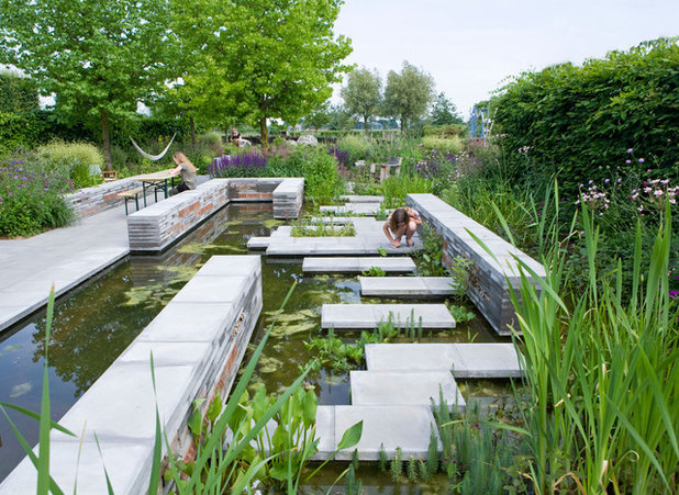
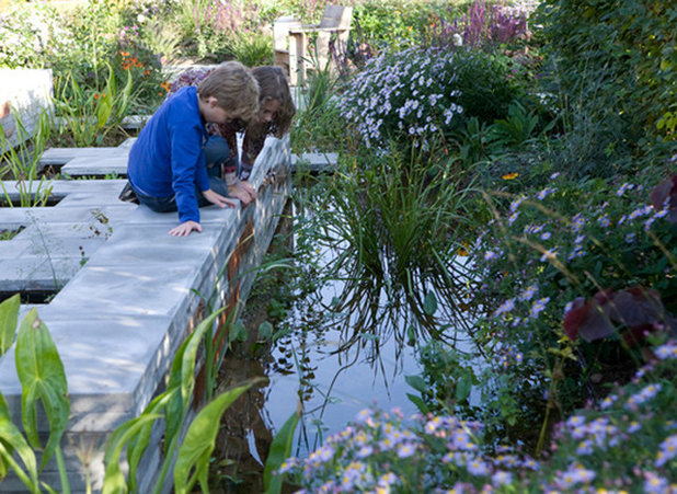
A Dutch icon reimagined. For this garden, Preston began by reimagining a standard element of Dutch landscape design: a long, rectangular reflecting pool. She explains that by deconstructing portions of this Dutch icon, she increased interest and accessibility while maximizing spatial functionality. Doing so made the pool more accessible to frogs and other wildlife. This new design conserves space by providing a walkway through the water with raised stepping stones. This feature also brings people closer to nature.
Studio TOOP
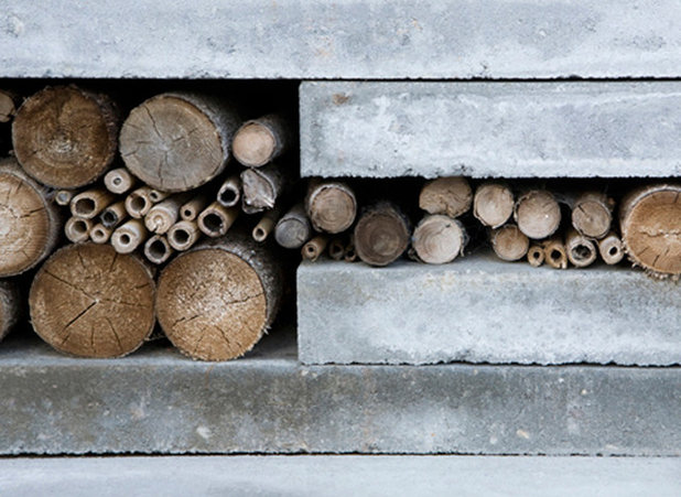
Walls provide space for beneficial insects. The pool walls create much-needed additional seating and provide habitat for beneficial insects in the form of hollow sticks and reeds. These “bee benches” and “insect hotels” are one way Preston raises awareness of nature.
She believes that if people experience nature in the garden, they will becomes its caretakers on a grander scale. Preston says it makes no difference to wildlife whether garden lines are straight or curved.
See how to make your own habitats for beneficial wildlife
Studio TOOP
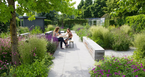
Tiers of built-in seating add a third dimension. Preston believes every inch counts in a small space and that features should perform multiple functions. The seating walls, shown here, are at different heights to add structure and dimension to the garden. They provide efficient seating, taking up less space than patio chairs would. Finally, the walls provide repetition and create coherence with other parts of the garden.
Studio TOOP
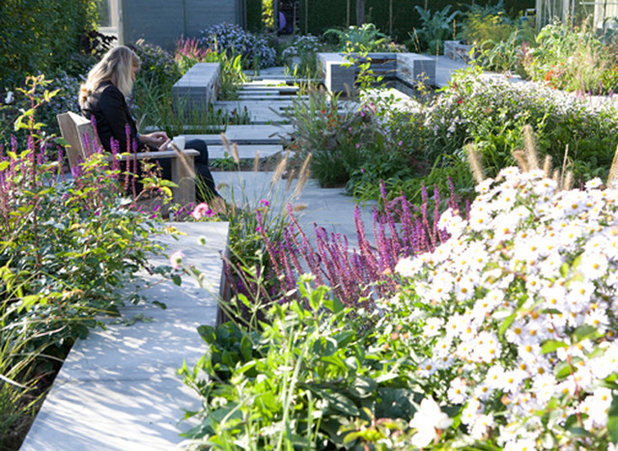
Structural plants soften the hardscape. An interesting garden is one that is filled with contrast. Preston admits she is
“less clean than a lot of Dutch designers” when it comes to her plant palettes. By this she means that she is less concerned about a tidy, formal look than are many in her field. Her palette brings softness to the garden that plays well with the strong lines of hardscape. Preston seeks to find a marriage between keeping the garden clean and creating contrast. She places importance on personally laying out the plants on each of her projects.
Studio TOOP
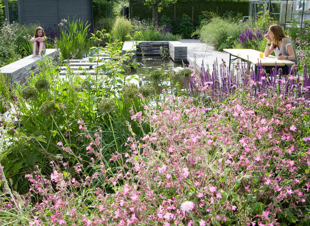
The planting design offers multiseason interest. Preston’s plant palette focuses on color and multiseason interest. In a small space, every plant needs to bring something new to the garden seasonally. This is how she introduces color to her sometimes monochromatic hardscape. Additionally, her highly textural plant palette plays well with brick, stone and lumber. Here, the garden is shown in June.
Studio TOOP
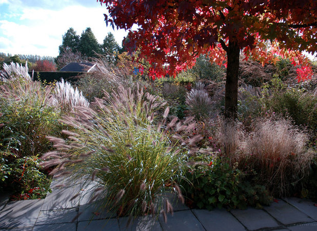
In fall and winter, long after summer’s flowers have faded, textural grasses and colorful foliage provide a different experience.
Studio TOOP
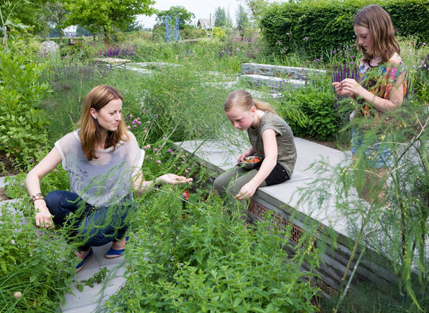
A snack garden for visitors. Vegetable gardens in urban spaces are frequently diminutive. Preston refers to this garden’s vegetable plot as a snack garden, where visitors can nibble on a pared-down selection while engaging in other activities. The emphasis here is on ornamental edible perennials — such as asparagus and cardoon, a relative of the artichoke — that play well in a garden of mixed perennials.
Studio TOOP
Something to appeal to all ages. Preston stresses the importance of designing a garden that appeals to all ages. In her designs she provides multiple points of interest to engage children. After all, they are the future.
More:See more inspiring urban gardens
Discover more ways to garden for wildlife


