Brick is one of the most popular choices for home exteriors in the U.S. For many, the Georgian home, with its brick exterior, grand scale and formal lines, personifies the American dream. Typically, a Georgian home has foundation plantings of boxwood. But Houzzers rarely want to be typical.
I believe in our hectic world we seek peaceful continuity in our personal spaces. A large part of that is creating a seamless dialogue between home and garden. Whether your home is made of brick, stone, siding or stucco, we can take some cues from our houses to make them truly at home in our landscapes. Let’s look at ways to work with brick.
Earth Developments, Inc.
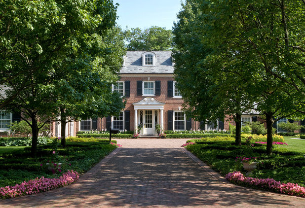
Play off the dominant color of your brick. One of the first things I do on an initial garden design consultation is take note of the home’s exterior. In the case of brick, there are generally many hues (colors) and tones (tints or shades) present. Creating a harmonious flow between house and landscape involves isolating these tones and creating a plan that pulls them into the garden.
The brick in this home predominantly sports tones of pink. A thoughtful installation of pink begonias near the entrance pulls the color forward, creating a harmonious scheme that is experienced in stages. Additionally, the horizontal white stripes of hosta blooms directly in front of the house mimic the white porch columns.
Kate Benjamin Photography LLC
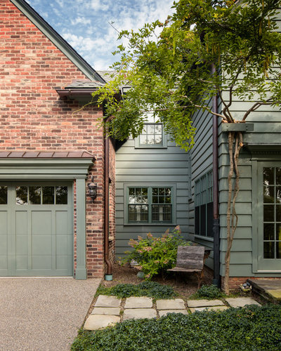
In the landscape, green is a neutral that grounds the space. By creating this foundation first, you can then embellish the garden with appropriate colors, shapes and textures. Green is rather like a rug that pulls together a room full of eclectic furniture. Additionally, it is a calm neutral that gives the eye a place to rest and keeps a space from appearing too busy. Too much green, however, can seem unimaginative.
In the example shown here, the tone of green on the siding contains a gray that complements the secondary gray coloration of the brick. The darker green ground cover provides a foundation for the scheme. Notice how the older blooms on the hydrangea next to the wood bench subtly repeat the pink tones in the brick. Don’t overlook the opportunity for seasonal interest to bridge home and garden.
The Artist Garden
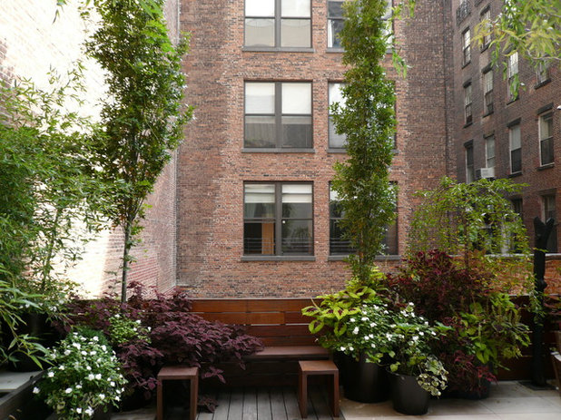
Pull out secondary colors. In this example we see brick that is primarily pink but has dark red highlights. Notice how the burgundy coleus accentuates the red in the brick. Without the coleus the red would go virtually unnoticed. By accentuating a secondary color, the designer of this garden has added depth and dimension.
Additionally, the columnar sweet gum trees accentuate the height and urban feel of the space, while the weeping cherry contrasts and reinforces the mounding shape of the container plantings. Reinforcing color with color and shapes with shapes can give your space a designer look.
Terra Firma Design
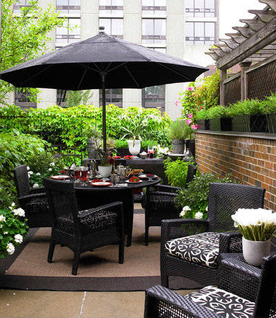
Don’t overlook the opportunity to use patio furniture to pull hues from your brick into your garden. Instead of reinforcing the brick’s primary orange hue by choosing orange cushions and an orange umbrella, this designer pulled from the secondary hue of black. The look is both contemporary and elegant.
Design Focus International
Paint your brick. If you simply do not like the color of your brick, consider painting it. It is an expensive option but a good option nonetheless.
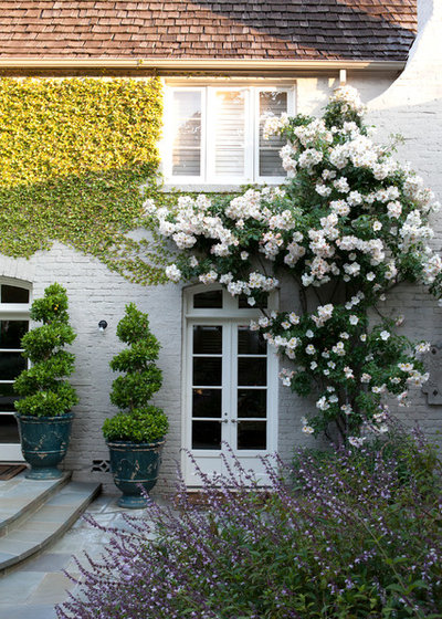
White brick is clean and classic. The white climbing roses bring both texture and a third dimension to this home in an elegant, refined way. Continuing the theme of white flowers throughout the garden would further ground the home in the landscape by providing continuity.
What You Need to Know Before Painting Brick
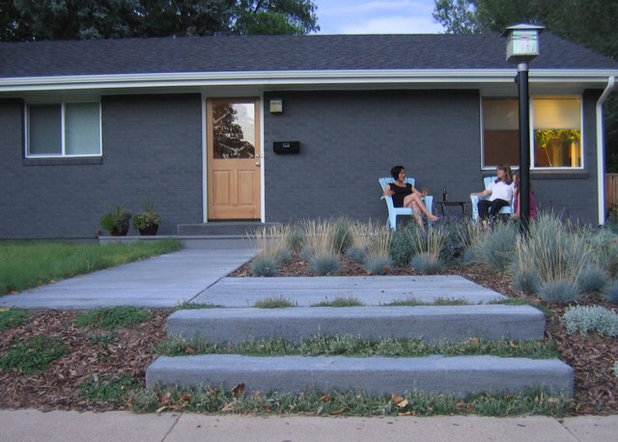
This nearly monochromatic gray home and garden work on several levels. Notice how the gray zigzag sidewalk pulls the eye toward the front door. The ornamental grass in nearly the same tone reinforces the quiet, subtle qualities of this vignette, while the seed heads repeat the color of the front door and provide textural interest. The only shot of vibrant color is found on the aqua chairs. If the front door were painted this color, the mood of this space would be quite different.
Wintersole Architecture
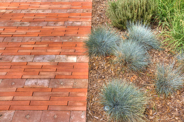
Use complementary colors. Up until now we’ve played it safe, pulling hues and tones from the house into the garden. Dare to mix it up a bit by consulting the color wheel to find complementary colors — that are opposite each other on the wheel. Orange and blue are two such colors. Notice how this vignette with orange brick and ornamental blue fescue (
Festuca glauca) really makes a statement. The fact that the hues of the brick and the grass both contain gray gives this space interest and continuity without the look’s being overly loud.


