During the first eight months Erica Taggart and Cory Eicher lived in their Brooklyn Heights, New York City, home, their backyard experienced the homeowner’s equivalent of Newton’s first law: A neglected yard will remain unused until acted on by an external force. So the couple hired landscape designer Sean Lewis and Jesse Terzi, who not only got them to use their backyard but also put the whole space in motion.
New Eco Landscapes
Photos by Anthony CrisafulliYard at a GlanceWho lives here: Erica Taggart and Cory Eicher
Location: Brooklyn Heights, New York City
Size: 560 square feet (52 square meters)
Completed: June 2014
The homeowners wanted an attractive outdoor space that was dog friendly. Lewis’ simple design allows them to choose how they use the space; it doesn’t impose any activities or functions on them. “We really liked it on first sight and continue to do so,” says Eicher. “The dogs like playing there, which is awesome.”
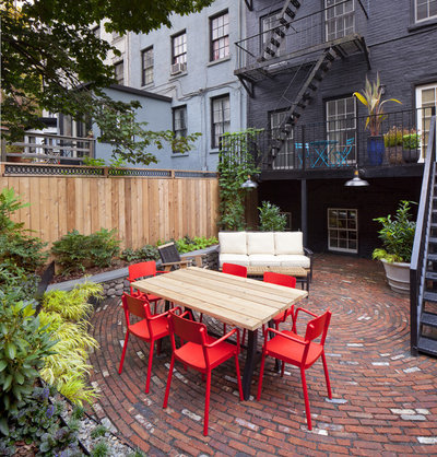
The surrounding New York City architecture was going to play a strong role in this garden, whether Lewis referenced it or not. The yard, though spacious for one in the city, is very much nestled in New York City. Instead of trying to match the adjacent buildings or turning away from them entirely, Lewis pulled materials from the surrounding architecture but incorporated them in a playful and modern way. Spiraled brick paving and abstract steel planters complement the metal staircase and brick facade of the home but draw a distinct line between new and old. Modern furniture roots the design in the present even more.
New Eco Landscapes
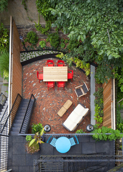
Lewis and Terzi’s firm, New Eco Landscapes, specializes in gardens in Brooklyn and Manhattan, so Lewis was comfortable designing a garden this size. “Understanding what you can fit into your space will help make the best use of it,” he says. What’s put in also affects how it looks. “This project makes use of grand gestures. I think that makes a big impact on a small space,” he says. Small features, like furniture and potted plants, can be moved, but the patio and retaining wall frame the yard.
Viewed from both the ground level and the terrace above, the yard has an implied velocity that stems from the brick paving. The owners originally wanted a labyrinth design, but the yard’s size and intended use as an outdoor living space didn’t leave enough room to use the labyrinth, Lewis says. He abstracted the movement of the labyrinth for the circular paving, still creating a meditative rhythm.
The reclaimed bricks sit on a sand and gravel base over existing concrete. Multicolored flecks pick up colors from the surrounding materials as the paving appears to spiral out. In a few places, Lewis interrupted the bricks with leftover cobbles from the wall with the new planter on the right side of this photo.
Turquoise chairs: Fermob Bistro Chair; red chairs: Lisboa Armchair
New Eco Landscapes
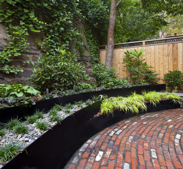
The painted steel planter meets the patio’s edge, matching the line of the bricks. Lewis designed the terraced steel planter first. “Everything fell into place after that,” he says. He removed an existing cinder block wall but maintained a terraced bed to accommodate the mature tree in the back corner of the garden. “We set steel posts in concrete and had a steel contractor cut, shape and weld the sheets to our posts,” says Lewis. The planter is about 3 feet deep in the center and fans out to about 7 feet deep on the sides, leaving plenty of room in the middle of the patio but accommodating more planting space on the sides.
The planters are filled with mostly evergreen foliage plants. “We chose really hardy plants that can handle shade or sun,” says Lewis; the garden receives full sun half the year and full shade the other half. A single plant and ground cover distinguish each level. River rock and dwarf mondo grass (
Ophiopogon sp) are in the foreground, while mulch and Japanese forest grass (
Hakonechloa macra ‘Aureola’) are in the background. Rhododendrons, hostas and ajuga fill out the rear planter.
New Eco Landscapes
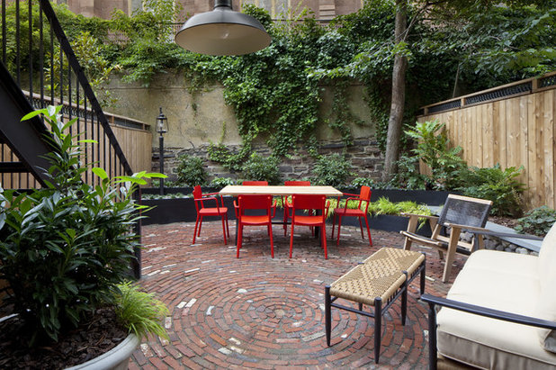
The distressed stone wall behind the planter abuts an old church. “The church is beautiful and a wonderful rear neighbor,” says Eicher. “We can faintly hear the organ and choir when we open our windows.” Lewis says the homeowners didn’t want to hide the wall, but he didn’t want to make it a focal point either. “As the rhododendron bushes get large, they will form a nice canopy to obscure but not completely cover it,” he says.
The designer provided the furniture for this project, as he does in many of his projects, eliminating any clash between styles. New Eco Landscapes designed and built the dining table from cedar with a steel base, and red dining chairs pop against the muted red brick and green backdrop.
New Eco Landscapes
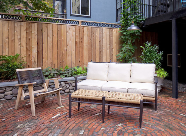
Lewis refurbished the existing cobblestone wall. He added a bluestone cap to finish the planter and create a comfortable seat wall. “It just happened to be perfect seating height,” he says. A new cedar fence provides privacy from side neighbors. An iron flourish along the top was inspired by the architecture of the church. New uplighting in the planters provides architectural drama at night, and light from lampposts and lanterns creates a welcoming atmosphere. Potted plants soften corners and allow for more planting versatility.
Before Photo
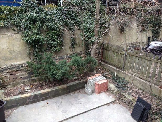 BEFORE:
 This is the rear corner of the garden at the beginning of the project. The mature tree, cobblestone wall and rear wall were all incorporated into the new design.


