Bed and pathway lines are important to how we view and navigate our gardens. A good garden designer will employ these shapes to influence moods and to dictate how and how quickly we move through a garden. Straight paths are utilitarian, moving people quickly from point A to point B. Curved and serpentine paths create a sense of peacefulness, causing people to stroll at a leisurely pace, stopping to enjoy vignettes and treasured plants. Then there are the zigzag paths. Enter
yatsuhashi.
“Yatsuhashi” is a Japanese term that literally means “eight bridges.” Originally, eight wooden planks were laid out in a zigzag pattern, without railings and generally over a shallow pond surrounded by irises. Legend has it that this pattern kept evil spirits away, because the spirits could not make 90-degree turns. This belief led to the construction of zigzag bridges and paths on temple grounds.
Let’s look at how to use this pattern, not only in Asian gardens but in contemporary, woodland and even traditional ones.
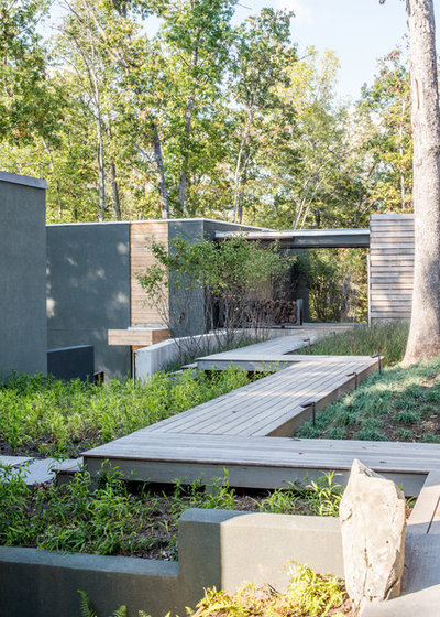
Grounded
This elevated boardwalk is laid out in true yatsuhashi fashion, with the lumber in each section leading the visitor forward. This creates an interesting and contemplative pattern. The lumber pattern is repeated on the dwelling, pulling the eye forward as well as upward and creating a homogenous, nurturing vibe.
Safety is a concern when building any raised walkway without a railing, so take this into consideration. In situations such as this, good landscape lighting is imperative.
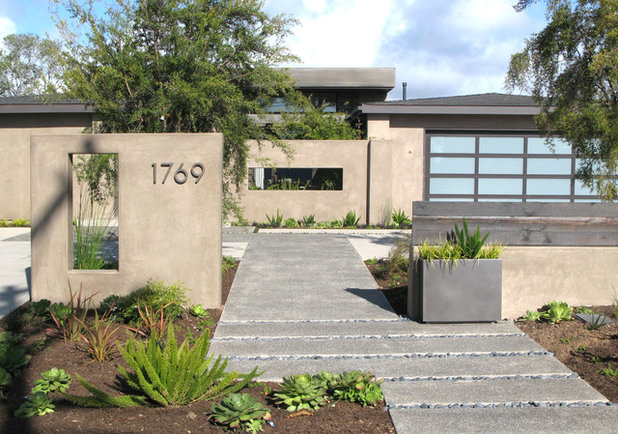
debora carl landscape design
The designer of this space adapted the yatsuhashi pattern to fit a contemporary space on a level plane. She added additional texture and interest by interspersing lines of river rock in between some of the pads to establish a rhythm. The color and pattern of the walkway are pulled up onto the garage door, again reinforcing that homogenous feeling.
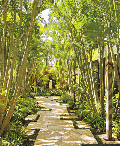
VITA Planning and Landscape Architecture
This garden features a modified yatsuhashi pattern to add invaluable interest to an allée of palms. The offset tiles are interplanted with a low ground cover in an effort to slow the garden visitor so that he or she will notice the majestic impact of this design. In addition, the path leads the eye onward to the focal point, the sculpture in the background.
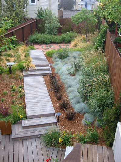
Arterra Landscape Architects
The designer of this urban stroll garden sited this yatsuhashi-inspired boardwalk on an angle to add interest as well as to make the most of a small space. The lumber runs from side to side rather than lengthwise; this unconsciously slows the gait of the visitor.
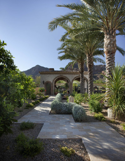
Exteriors By Chad Robert
The designer of this garden employed the concept of asymmetrical balance so that it can hold its own against a very large and dramatic outbuilding. Even though the palms make a bold statement, notice how the walkway shifts the eye to create an effective sense of balance. The low blue hedge reinforces this balance. Finally, notice how the textural palm trunks reinforce the texture of the building’s tile roof in this well-planned space.
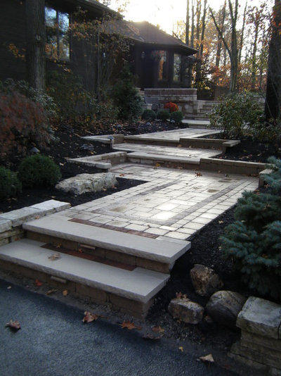
Aaron Moses
This paver walkway is wide and low, complementing the lines of this single-story contemporary home. Additional interest comes from the pavers’ being laid in a bordered pattern so that each section of the walkway stands on its own while still relating to the whole. This fosters a contemplative mood, not unlike a labyrinth.
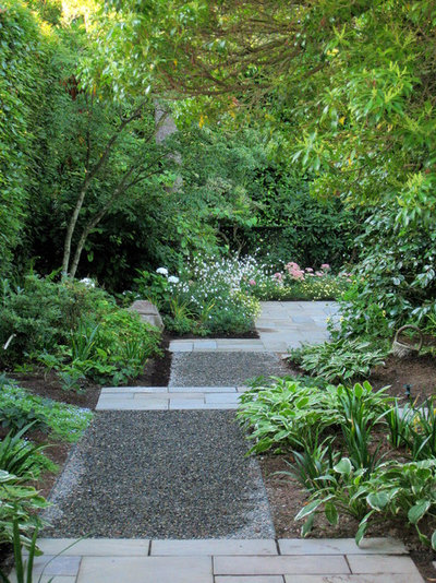
ModernBackyard
The use of two different textures in the same hue creates a peaceful contrast in this woodland garden, and there is something appealing about the crunch of gravel underfoot. Notice how the bluestone sections lead the eye to the patio in the background.
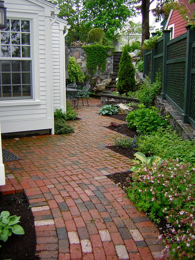
Piscataqua Landscaping & Tree Service
A yatsuhashi pattern should not be limited to Asian or contemporary gardens. Here we see this pattern effectively used in a traditional New England–style space. The walkway angles mimic the footprint of the house, again creating that homogenous feeling. The illusion here is that the eye is slowed down even though the traffic pattern is in reality a straight line.
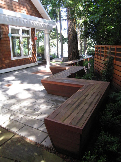
2.ink Studio | Landscape Architecture
Finally, we see yatsuhashi used in another traditional space, this time for seating. Notice how this configuration adds a unified and unexpected design element to this space in a way that a set of patio furniture could never do.
Consider using a yatsuhashi pattern when you need to introduce a strong element to make sense of an ordinary space, when you want to lead the eye to a focal point or when you need a bit of Zen in your life.


