Monet gave us wonderful insight into the use of color, transferring his skills with canvas to the gardens of his house at Giverny; Matisse’s collages showed us how to use shapes in our gardens. But of all the influential artists at the turn of the 20th century, the Dutch painter Piet Mondrian excelled beyond the others. He was both a theorist and a draftsman, who believed that a painting style focused on line and color could set an example for other arts.
Besides the reproductions of his trademark grid paintings, his use of color and line separation can be seen all around us in graphic art, architecture and contemporary garden design. As a theorist, Mondrian used his writings to explain why he composed his famous geometric abstracts, but most of us interpret his ideas in our gardens using the grid design of his paintings.
Exhibition: “Mondrian and His Studios,” at the Tate Liverpool in England, June 6 to October 5, 2014. It marks the 70th anniversary of Mondrian’s death.
Tom Stringer Design Partners
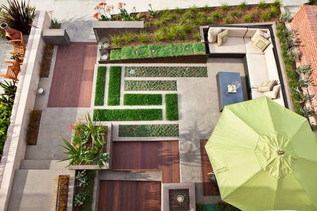
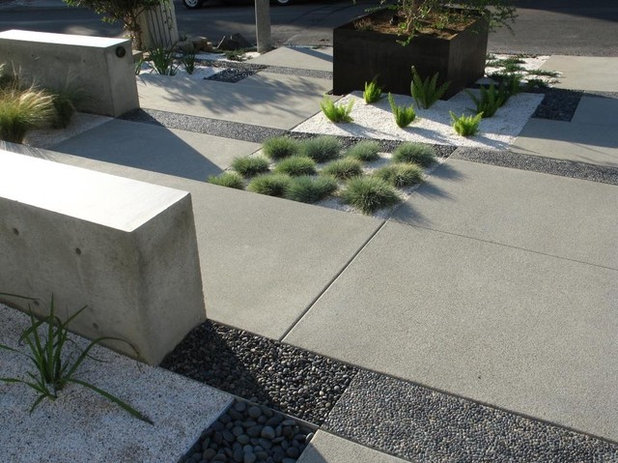
Looking down on this garden, we see the classic features of Mondrian design — the rectangles, or planes of colors, separated by lines. Here, though, the rectangles are composed of planted blocks separated by stonework.
To achieve the full Mondrian effect, the plants need to be, as in this case, compact, preferably evergreen and closely planted, yet allowing the structure of the design to show through.
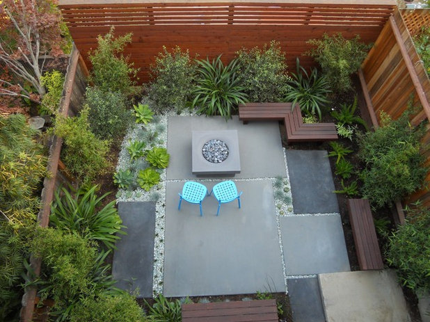
Plants do not have to be the focus of this style. Planes or strong blocks of color can be composed of many materials, in this case poured concrete.
The gravel borders serve the same purpose as the black lines in a Mondrian painting. Not only do they separate the planes, but they also create movement and lead the eye through the design.
MyLandscapes
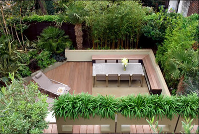
Mondrian was very interested in space and how we view it. Though this contemporary design may seem a long way from the grid paintings of Mondrian, it still incorporates his basic ideas of the use and control of space.
Mondrian’s paintings were very flat, with no hint of shadow or perspective. He worked hard, applying many coats of paint, to achieve that flatness. Though the design doesn’t have a grid, it has large planes of flat color that are balanced with areas of noncolor, creating both form and space.
Dean Herald-Rolling Stone Landscapes
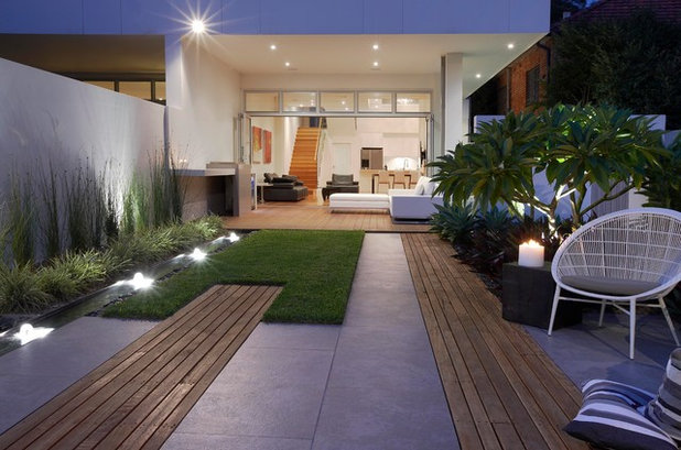
We can clearly see the evolution of Mondrian’s theories in this modern design. The rectangles of color and noncolor may be elongated here, but they still relate to each other and present a very flat surface.
Grounded - Richard Risner RLA, ASLA
The beauty of this garden is without doubt the flat planes of neutral color and mixed textures, combined with the attention to detail.
Some of Mondrian’s early work used much more muted colors than the bright primary colors of his later work that we are familiar with. The neutral colors here create a wonderful monotone rendering of planes and lines.
Cablik Enterprises
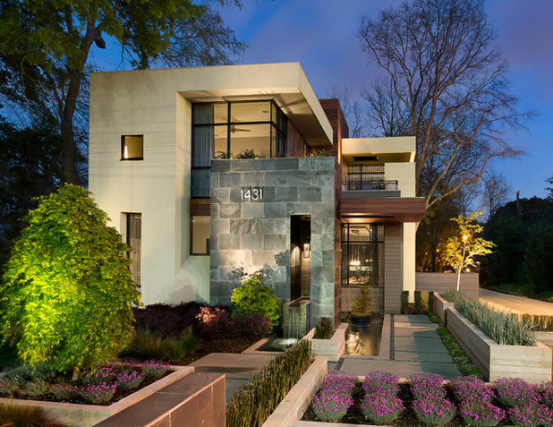
As opposed to Mondrian’s perfect flat planes, gardens tend to be built with the third dimension. But we can still use his theories in three dimensions.
Here the house and garden seem as though they have been designed as one. Both have strong Mondrian-esque features, including rectangular planes, though the garden especially gives us a great template for creating a Mondrian design. The composition is centered around closely planted raised rectangular beds that have been separated by paved walkways and narrow planted beds. The paths and narrow plantings follow Mondrian’s belief that grid lines create paths of movement for the eye.
Tim Davies Landscaping
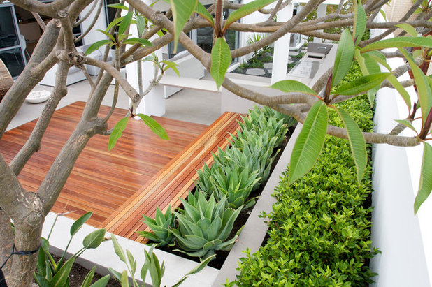
In smaller garden designs we can also see the influence of the artist. As in the previous garden, blocks of plantings in rectangular beds create flat planes that are demarcated by noncolor masonry dividing walls here.
Barnes Vanze Architects, Inc
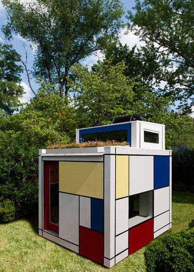
Perhaps you feel that the above examples aren’t close enough to Mondrian’s work as we know it. If so, maybe you’d like to invest in a Mondrian-style playhouse?
Exhibit: “Mondrian and His Studios,” Tate Liverpool in England, June 6 to October 5, 2014
See more modern outdoor spaces


