Famed French artist Henri Matisse’s cutouts exhibition will be the highlight of the modern art world in 2014. The Tate Modern will be the first to host the show, before it travels to New York’s Museum of Modern Art. Then the works will return to private owners and galleries across the world.
In his early life, Matisse painted in a traditional manner, but in 1941, after a serious operation left him bedridden and unable to take up his brushes, he began using scissors instead, cutting colored paper to create
gouaches découpés (collages or cutouts). Matisse’s cutouts are all about the use of bold shapes and colors — their interaction and the space they are contained in.
We can look to Matisse’s cutouts to help us with our garden design. Those of us who aren’t skilled at drafting, or drawing detailed plans for the designs of our beloved plots, might find the collage method a great alternative.
Cut bold shapes using colored card stock or paper to represent different areas of the garden. Then play with them on a piece of paper, altering their size or shape if needed. With patience you can achieve a design that suits you and that also has the boldness of a Matisse cutout.
Let’s look at some examples of gardens that could easily have been designed using cutouts or influenced by the art of Matisse.
Henri Matisse: The Cut-Outs Tate Modern, South Bank, London, April 17 to September 7, 2014
The Museum of Modern Art, New York City, October 14, 2014, to February 9, 2015
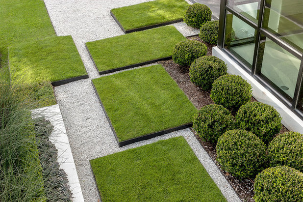
Exterior Worlds Landscaping & Design
The uncomplicated shapes of this almost two-dimensional design could easily have been achieved by using collage design. The rectangles neatly balance one another and are integral to the larger landscape design.
How easy would it be to move around cut shapes of green paper, rather than drawing the shapes on a plan, to get the feeling not only of their size and relationship to one another, but also of their mass within the design?
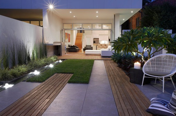
Dean Herald-Rolling Stone Landscapes
After cutting out shapes, Matisse would arrange and rearrange his cutouts until he was satisfied with the results. Sometimes this would take months; the works were pinned on a wall so he could view the compositions.
Follow Matisse’s example. Once you’ve completed your garden cutout, stick it on the fridge door and live with it for a while. Make changes with the scissors instead of expensive changes to the landscaping once it’s finished.
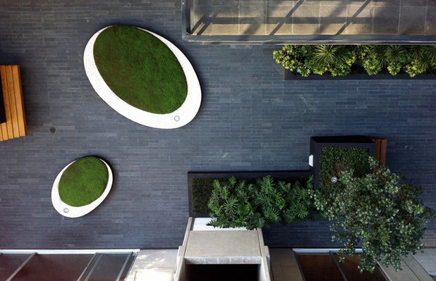
JSchmidt arquitectura y paisaje
Besides the intense use of color in Matisse’s work, the sense of proportion and balance in the sometimes very simple images is striking.
We can see this same effect in many contemporary gardens — the shapes are simple, almost basic, but they are in perfect balance, filling the space and allowing their individual masses to sit comfortably together.
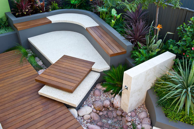
Cultivart Landscape Design
Matisse’s most famous cutout is called “The Snail.” It’s large, 9 feet by 9 feet, and it’s a composition of different-colored squares and rectangles that interact with one another, barely touching, set within an irregular orange border.
In modern garden design, we love to have strong, simple shapes interact with one another. But it is not easy to get it right. Matisse showed us in works such as
“The Snail” that getting the structure and scale correct within a boundary leads to a design that not only works, but is pleasing.
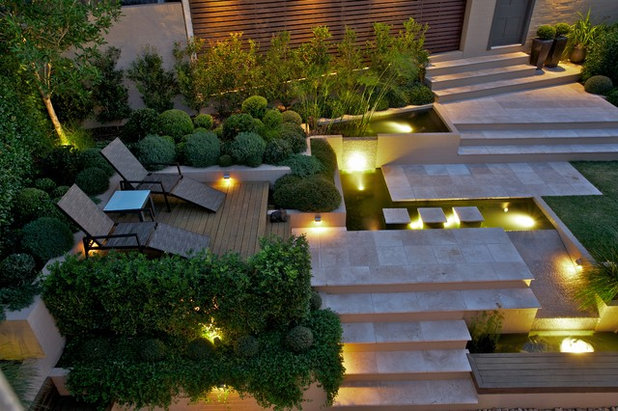
The varied shapes of the features within this section of a contemporary garden could have looked busy and cluttered, yet all the pieces fit together.
Garden Architecture
Matisse had a love of sinuous curves. A great many of his cutouts were of human figures, his most memorable being the “Blue Nude” series, in which the figures seem almost contorted as they dance across the paper.
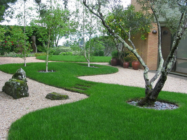
Curves can be difficult to use in garden design, because gardens tend to be set within straight rectangular boundaries. The wonderful grass shapes here follow Matisse’s example and create wonderful movement in the space while still being at one with it.
Outside Influence Landscape Design Group, LLC
“Lagoon” is another example of Matisse’s love of and skill at using curved shapes in cutouts. In it he allows sinuous shapes of purple, white and black to meander across a background of green and blue. It could easily have seemed disjointed and busy, but Matisse’s skill is once again his ability to get the scale, balance and proportions just right.
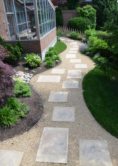
The sinuous shape of this otherwise simple gravel path works well for the same reason — it is balanced within the context of the space. The placing of the pavers within the pathway would be a great exercise for using cutouts in the design process.
Art in Green
One thing above all that we can learn from Matisse is how different shapes can be used within a defined boundary. By studying his cutouts, we can learn how to simplify our designs, creating a perfect structure of balance and scale without getting into details that can sidetrack the designs.
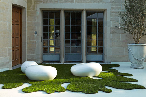
This garden could have been cluttered with the different shapes and materials used, but it flows beautifully; all the areas are linked.
Margie Grace - Grace Design Associates
So if you’re intending to design or redesign a garden, before you get your spade out, grab your scissors and take a leaf out of Matisse’s book: Start by designing with cutouts.
Better still, before you start, immerse yourself in Matisse’s wonderful cutouts at the Tate Modern or MoMA exhibition.


