Many professional models are photographed from one angle, their best side. A truly beautiful model, however, will look great from any angle. Similarly, many of our gardens are designed, usually unintentionally, to look good from one vantage point. If it's a front yard, that vantage point is traditionally the street. If it's a backyard, that spot is most likely the back door, deck or patio. We probably all have spots in our gardens that leave us less than satisfied, wanting more. At some point it's time for a makeover.
Several years ago I received an inquiry from a homeowner with an undeveloped backyard that sloped dramatically toward the lake. The difficult thing about this project was that the backyard was viewed from many different angles. There were two loggias, one on the first floor and one on the second, plus a view toward the house from the lake, and finally, a view from a sidewalk. Then there were the deer, dozens of them.
How was I to process all of this into a beautiful, cohesive plan? Perhaps your space isn't this complicated but you know deep inside that you haven't yet tapped into its full potential. Here's help in creating a garden space that looks good from any angle.
Huettl Landscape Architecture
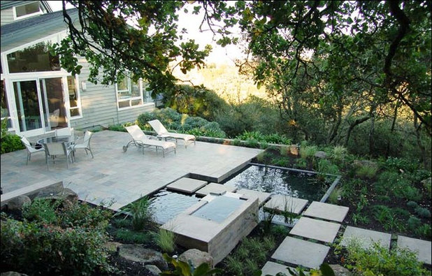
Vary the heights. Engaging a prominent third dimension in your garden is a solid way to add interest. Notice the varying heights of the planar surfaces here. This garden would lose much of its interest if all the surfaces were on the same level. It's strong enough now to command attention when viewed from any angle.
D-CRAIN Design and Construction
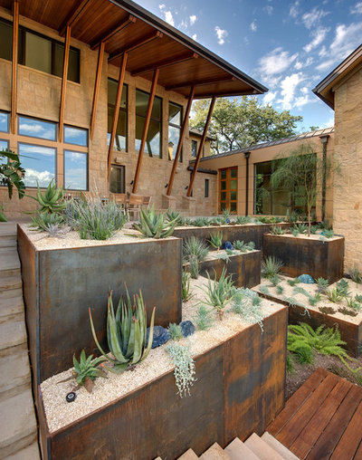
Let's consider this remarkable three-dimensional courtyard. The varying heights of the Cor-Ten steel planters add immeasurable interest. The lower wooden decking, juxtaposed with the steel, provides continuity in color while adding textural interest. The upright spiked form of the succulents mimics the vertical support beams on the house.
Gregory Lombardi Design
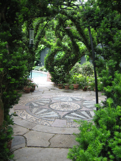
Add artwork. Another way to add multilevel interest is to employ appropriate artwork. This stone medallion is a centerpiece that looks great from any angle. If you are considering sculpture, make sure that its form and dimensions make a statement from every vantage point. A tall, narrow sculpture, for example, would most likely look underscale and inappropriate viewed from above.
Adam Woodruff + Associates, Garden Artisans
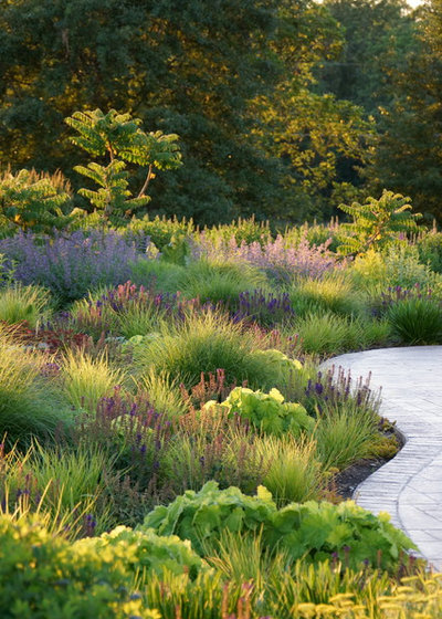
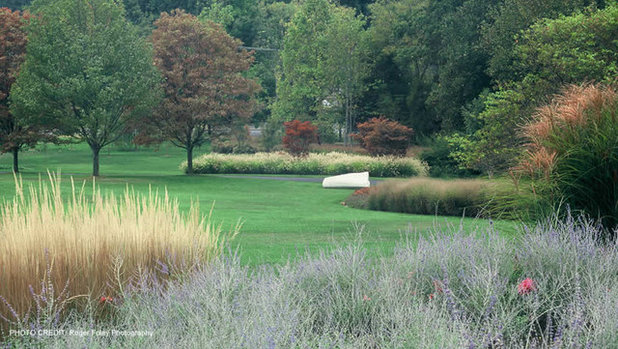
Plant en masse. Now that we have discussed hardscaping, let's move on to planting schemes. Mass plantings of the same or similar plants will most certainly have a positive impact in your garden when viewed from above or at ground level.
Notice the beautiful variety of clumping and upright plants in the prairie-style garden here. An incredible amount of interest is produced due to the appropriate and artistic use of texture, shape and color. The serpentine hardscaping lines make a bold yet relaxing statement from ground level and would take on an artistic flair if viewed from above.
Clinton & Associates, PC Landscape Architects
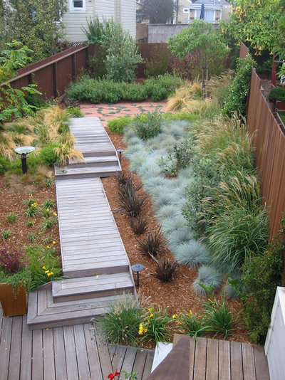
Mix textures and materials. The design of this garden is relaxing and continuous while including a variety of ornamental grasses and Russian sage (
Perovskia atriplicifolia, zones 4 to 9). The similarity of form and variety of material create cohesion and interest. With its serpentine bed lines, the garden pulls the eye through the space from every angle.
Arterra Landscape Architects
3 Garden Case Studies
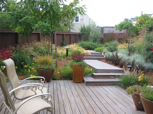
1. The urban boardwalk. This urban backyard is packed with interest from every viewpoint. Running the boardwalk at a diagonal to the fence has created unexpected interest that draws the eye and engages the viewer.
Arterra Landscape Architects
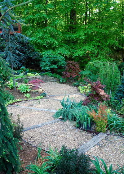
The same garden is arguably even more interesting at ground level. The boardwalk draws the eye through the space, enticing the viewer to experience each vista. The mass plantings of ornamental grasses from side to side bring much-needed continuity and softness to this contemporary garden. The planar surfaces create the illusion of spaciousness.
Jay Sifford Garden Design
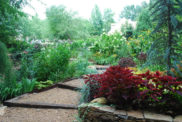
2. The woodland path. I live on a very wooded lot, with the front yard receiving most of the available sunlight. My deck wraps around the front of my house, so this garden space is viewed from the street, the yard back toward the street and looking down from the deck.
I wanted a usable front yard, so I designed a serpentine, wider-than-normal pathway to a stacked-stone seating wall. Strong path lines boldly define both the space and its purpose. Because this garden was a clearing in the forest, I made the path very wide; this negative space allowed me to overflow the beds without making the space look or feel too busy. A narrower path would have felt claustrophobic. Since the garden is informal by design, I used repurposed railroad ties and gravel to carve out terraces to give the visitor places to linger and enjoy the space.
Repetition is a very useful concept to help a space feel homogenous and familiar. Here I used Japanese maples and chartreuse foliage along the pathway to create continuity.
Jay Sifford Garden Design
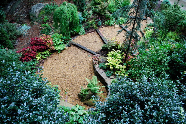
This second view is looking from the seating wall back toward the street. The challenge here was to hide views of the street and neighboring houses, as I wanted to have a degree of privacy.
As I planted my trees and larger shrubs, I made sure they were precisely placed to hide as many of the undesirable views as possible. When siting trees and shrubs, always look at them from multiple viewpoints. Sometimes moving a plant 6 inches can make an immeasurable difference in the overall feel of a garden.
Jay Sifford Garden Design
The third view is looking down from the deck. Prominent lines define the space, carving out a bold presence in the midst of the forest. Without these prominent lines, the space would uneventfully fade into the woodlands. Pops of chartreuse accentuate the space and cross over the path, while burgundy and blue foliage both stand up to the chartreuse and calm it down just enough.
Jeffrey Gordon Smith Landscape Architecture
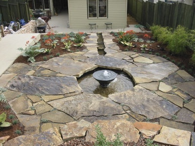
3. The running rill. Strongly defined lines provide the interest that draws the eye inward toward the focal point here. Notice how the urn in the center of the water feature mirrors the color and shape of the flagstone. By providing this continuity, the designer has created an informal yet organized space.
Jeffrey Gordon Smith Landscape Architecture
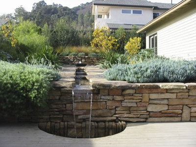
This garden works just as well from ground level, providing continuity from one garden room to another. The color of the hardscaping and the flow of water from one focal point to another guarantee a relaxing garden experience.


