We gardeners have many reasons for doing what we do: for braving mosquitoes and poison ivy, for dragging mud into the house on our shoes, for drenching our clothes in sweat. At the end of the day, our efforts should culminate in the creation of a highly personal extension of that multifaceted and ethereal thing called beauty. In our efforts to achieve this ideal, we employ, knowing or unknowingly, various concepts and techniques, such as rhythm, proportion, scale, balance, layering and color.
Let's look at another technique that can add an entirely new layer of interest to your garden: one that will set your garden apart from your neighbors', one that will spark some serious garden envy among your plant peers. Let's master the art of juxtaposition.
Juxtaposition is the act of placing two or more items side by side for the purpose of comparison and contrast. Chefs frequently employ this technique to come up with new culinary masterpieces. Think of sweet and sour, or sweet and savory. How else can you explain smoked-bacon crème brûlée? There's something about these creations that fosters culinary tension and challenges our palates. We can do the same in our gardens to create more interest. Here's how.
There are at least four characteristics that all the pieces of a garden, whether plants or hardscaping, possess. They are color, shape, size and texture. To create dynamic tension — the positive force that keeps our eyes occupied and moving around — pick two items with just one or two characteristics in common, then dare to place them side by side.
In other words, dare to compare and contrast. You'll be on your way to adding that new layer of interest to your garden.
Aloe Designs
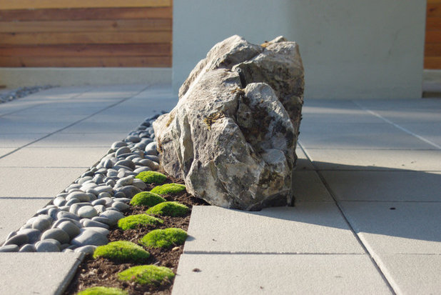
This thoughtful space is a perfect place to start — so perfect, in fact, that it could be labeled Juxtaposition 101. Many elements are at work here, but notice how the result has an aura of simplicity that makes it feel like an oasis in the midst of an obviously urban environment.
The river rocks and the moss share a similar size and shape but are totally disparate in color and texture. This similarity and disparity work together to capture the eye by creating a high degree of interest. Additionally, the river rocks relate to the boulder through the commonalities of color and texture but contrast in size and shape.
Finally, both types of rock relate to the concrete pavers with regard to color and texture but exhibit disparity in size and shape. Take a moment to assess your emotional reaction to this vignette as well as the reasons for your reaction.
Jay Sifford Garden Design
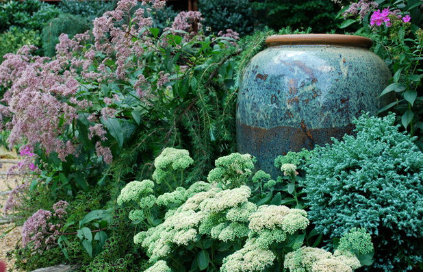
Perhaps the previous example was a bit too contemporary for your taste. If so, consider this vignette. Juxtaposition is used here in two ways. First, notice the relationship between the sedum (
Sedum x 'Autumn Joy', zones 4 to 11) and the Joe Pye Weed (
Eutrochium purpureum, zones 4 to 9). The inflorescences, or flower heads, are similar in shape and, once the sedum opens, will be similar in color. They obviously differ in size and textural form.
Second, the blue Japanese false cypress (
Chamaecyparis pisifera 'Curly Tops', zones 4 to 8) is juxtaposed with the large ceramic piece. They obviously share a beautiful blue color, but notice the shapes. They are both somewhat round, but the comparison goes further, as the top line of the conifer mimics the predominant line in the pattern of the pot's glaze. They obviously contrast both in size and in texture. This conifer reminds me of a steel wool pad. All of this makes for a captivating garden spot.
Exteriorscapes llc
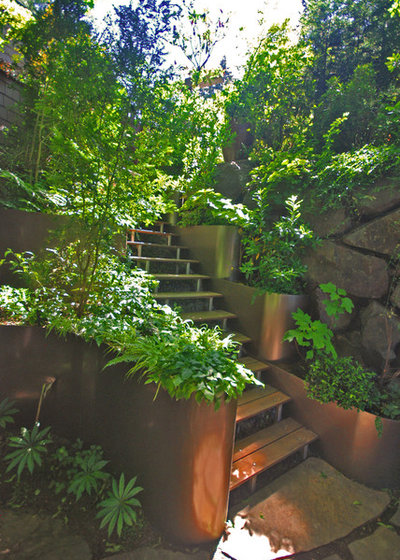
Here we see some enviable garden steps. Note the elements involved, particularly the metal stair rail and the boulder wall. These two elements have comparable sizes and shapes yet contrast in texture and, more subtly, in color.
I don't know about you, but I want to take a walk down these steps and spend some time in this garden. With an entrance like this, it's bound to be spectacular.
Charles McClure - Professional Site Planning
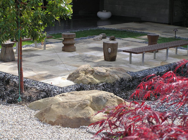
This patio is full of interest. Why? Because it exemplifies juxtaposition. The boulder rises from the stone patio like a volcano rises from the sea. Both the boulder and the pavers are related by means of material and share similar colors, but they differ with regard to size, shape and texture.
In addition, the river rocks and the pea gravel share shape and texture but contrast with regard to size and color.
You may find that in juxtaposing two very dramatic elements, such as the boulder and the patio here, one element of similarity may be just enough.
Studio William Hefner
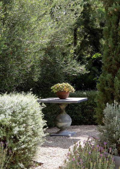
In this vignette the globe-like shape and color of the table base relate to the potted lavender and, to a certain extent, to the shrub on the left. The textures and sizes of the elements differ. The shape is also captured by the pot atop the table. By keeping the color palette similar and muted, the designer has created a tranquil space.
Margie Grace - Grace Design Associates
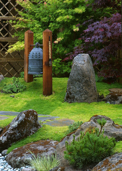
Notice the bell and the upright boulder juxtaposed in this Asian garden. The shapes and sizes are comparable yet the colors and textures are somewhat different.
This subtle contrast helps to facilitate an overall peaceful, introspective feeling in those who are fortunate enough to enjoy this garden. Can't we all use an extra dose of that?


