I bet I know what you’re doing right now. You’re looking for ideas for your garden, hoping to find that one inspiring photo that starts your creative juices flowing. The one that results in an “ah ha!” moment and breaks a stubborn case of designer’s block.
I encourage my students and readers to analyze and deconstruct the design principles that underlie gardens that inspire them. Humans have a strong attraction to color (we don’t have 6 million cones in each eye for nothing), so it might seem logical to focus your design energy on conjuring up beautiful foliage and flower combos.
For me, that’s the last step. Before you get carried away, zoom out and think about how that inspiring garden uses the overall space. Not to get too technical on you, but observe how much stuff is in the garden and how much space is left. "Stuff" is a not-so-sophisticated term for the plants, boulders, furnishings and constructed elements that you’ll find in most gardens. "Space" refers to the unencumbered surfaces you can move through without bumping your shins or that you can look across: paths, lawns, paved areas or the surface of a pond. The principle of stuff versus space applies in many design disciplines; think of the way a graphic artist uses white space to bring visual balance to the text and images on a page.
Also, look at how these two complementary elements are arranged and balanced. Are the masses and objects formally aligned along an axis, or does the visual weight of the composition create a less-deliberate feeling? This simple but frequently overlooked design principle affects our fundamental spatial experience and needs to be considered whether you’re designing an entirely new garden or simply revamping a few beds in your existing yard.
Let’s see how this concept applies to a selection of gardens.
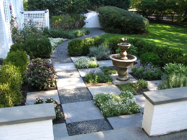
Schmechtig Landscapes
I find this space delightful. The grid instills order to this vignette but avoids the overly static feeling of bilateral symmetry, as there are four grids to the right of the path and only one to the left. The fountain — the dominant mass in this space — sits two grids away from the path but is centered between the seat wall and the loosely clipped boxwood hedge. The checkerboard arrangement of paving and plants is playful and enlivening, while serving as a repeating theme that binds the garden together.
In the distance, the massive shrub at the gate is well balanced by an uninterrupted plane of lawn. Also, notice how your perception of this space is dictated by the arrangement of the elements, not the color of the flowers or character of the plants.
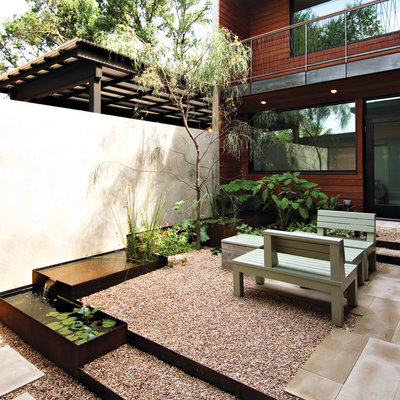
Jobe Corral Architects
When there isn’t a lot of outdoor space to work with, but the desire for living space is a high priority, utility has to come first. Consider the activities you desire and the furnishings needed to support those activities. Be sure to include enough space surrounding the area for unimpeded circulation.
As the young tree here grows, it will form a light canopy over the room, changing the proportions of mass and space, as will the leafy shrubs in the corner. If this arrangement of plants and open space feels too sparse for your liking, you could trade the gently cascading water feature for additional planting beds. In terms of how the space is arranged, all the forms are parallel and perpendicular to the building, creating a somewhat formal feeling.
Consider how the distribution of space and stuff might look on a pie chart. I’d call this about 80 percent space and 20 percent stuff, at least until the tree puts on more growth.
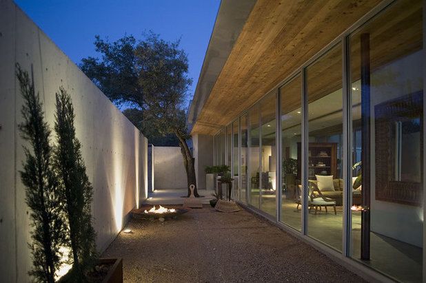
Hargrave Architecture
This sparsely filled, narrow outdoor room has the feeling of a contemporary art gallery, with a handful of objects and plants breaking up the empty corridor. The overall effect is that of a still-life composition viewed from inside the house, which is similarly furnished in a spare, uncluttered style.
The lesson here: If you’re attracted to this type of garden, it’s probably a reflection of your own desire for a simple, Zen-like aesthetic. Continuing with the pie chart analogy, it would probably look like 95 percent space and 5 percent stuff.
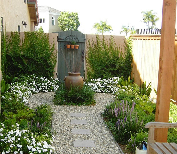
debora carl landscape design
Using my very unscientific analysis method, I’d say this garden is 40 percent space and 60 percent stuff — hence the more intimate appearance. The garden has an obvious central axis, and the garden elements on each side of the imaginary line mirror one another. With the exception of the creeping fig (
Ficus pumila) on the wall, all the plants will grow no taller than knee high, assuring that the beds will remain uncluttered. This approach retains a feeling of openness and focuses attention on the urn at the center of the “keyhole”.
Goodman Landscape Design
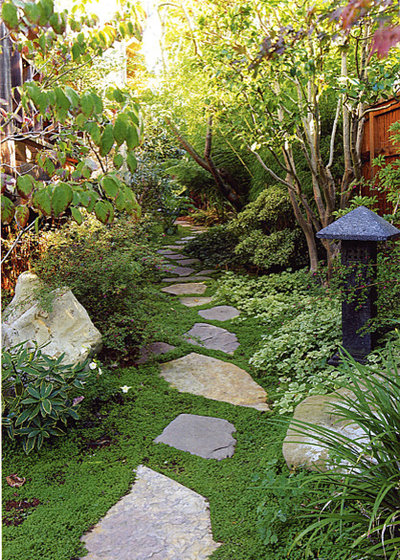
And now for something completely different. My first impression of this garden is that it's intimate and romantic. Why? It’s not the specific plants the designer chose but the way they overhang the path and encroach from the sides. There’s just enough space to pass, and the rest is populated with a luxurious, verdant canopy and finely textured ground covers. Although the massing of plants is more or less balanced on each side of the path, the sinuous nature of the stepping stones creates an organic flow, in some cases obscuring the destination.
How would you divide this? I’m comfortable calling it 10 percent space, 90 percent stuff.
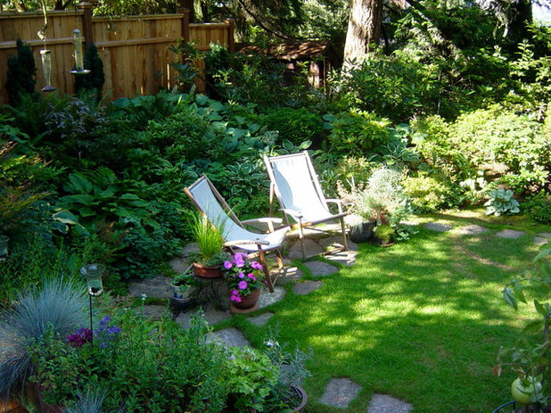
I just looked up the definition of "cozy." It didn’t have a picture of this exact garden, but it could have. Cozy doesn’t happen by accident. Notice how much space was allowed for the voluptuous bed behind the chairs. The trunk of the tree and the shade pattern tell us that there’s a generous canopy sheltering this chill-out space, but it avoids seeming claustrophobic because the mass is balanced with a small, open lawn. Details matter: The placement of colorful potted plants flanking the chairs increases the feeling of intimacy by compressing and embracing the space.
Maria Hickey & Associates Landscapes
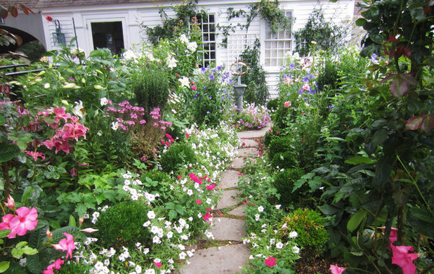
This might be a good garden to wrap up this design lesson with. It might sound obvious, but assuming you have at least average gardening skills, your plants will grow larger than they were the day you installed them. Unlike interior design, in which your coffee table more or less remains the size it was when you brought it home, your plants will keep changing. That means your stuff and space percentages will evolve over time. That’s not a good thing or a bad thing, but it’s worth thinking ahead when you decide how many plants to buy and how to space them.
This giddy garden appears to be devouring the path. Everywhere you look flowers are bumping up against their neighbors, like a mosh pit of perennials. It’s charming and well suited to the style of house and, I assume, suits the owner’s sense of style. The point is, if your goal is to maintain a certain balance of space and mass, pay attention to the mature size of each plant you select, allowing adequate space to achieve the size nature intended.
Lay of the Landscape: Find your garden style


