Proportion and scale seem to be the most challenging concepts to pull off correctly in the landscape. I've seen so many spindly arbors and trellises that look fragile and temporary. And I've noticed how sad and lonely tiny little flowerpots can look on a huge patio. People seem to be afraid to go big in the landscape. As one savvy designer pointed out to me years ago, when the sky is your ceiling you don't have to worry about doing something too large.
According to
Design Through Discovery, my reliable, dog-eared college reference book, proportion usually refers to size relationships within a composition, such as how a piece of furniture occupies a room.
Scale indicates size in comparison to some constant, such as the size of the human body. That's where the terms "small scale" and "large scale" come in, since they refer to the out-of-the-ordinary size of things.
When you see a space where everything is in proportion and the scale is appropriate, it's visually exciting. Take a look at some of the best examples I discovered on Houzz.
More garden design elements: Line | Rhythm | Shape and Mass | Space |Texture | Color
Jeffrey Gordon Smith Landscape Architecture
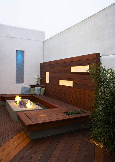
This outdoor living room features excellent use of proportion and scale. The height and depth of the visually floating wood structure are related, with each section in equal proportion to the other. The wood wall section is also about two-thirds the height of the white stucco courtyard wall — a pleasing ratio.
The U-shape bench embraces a fire table that fits into the opening like a perfect puzzle piece. Finally, the wide wood planks repeat the scale of the diagonally laid wood decking — a nice contrast.
John Maniscalco Architecture
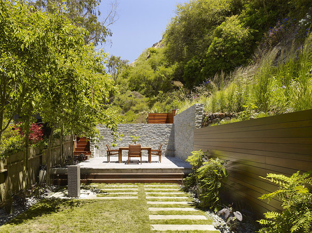
There's a beefy feeling in the materials used for this outdoor dining room, but their proportion and scale feel completely appropriate for the setting. This is a relatively narrow space for a dining terrace, yet the narrowness is offset by the elongated proportions.
First, you notice it in the wood retaining wall. Then the same wall proportions are used on the stone facade to partially enclose the raised platform. As for scale, the dining set nicely occupies its designated space — you wouldn't want anything smaller here.
Whitten Architects
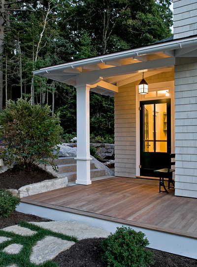
The home's exterior millwork is substantial, lending prominence to the overhanging porch roof. The support post blends with the overhead beam and probably measures 10 or 12 inches. The designer has treated the support post as a piece of architecture rather than as an afterthought, giving it an important role in the overall composition.
Scot Eckley, Inc.
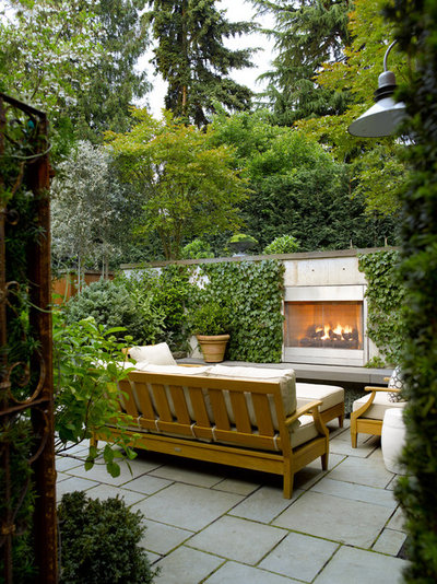
Imagine this outdoor living room with different furniture — maybe white wicker. It would feel lost in this beautiful environment. Instead, this furniture is bold and confident. Substantial in size, the teak sofa and armchairs relate beautifully to the other features of this outdoor room, including the oversize bluestone pavers and fireplace wall. The furniture is also scaled comfortably for the exterior setting, where large conifers loom overhead.
Johnsen Landscapes & Pools
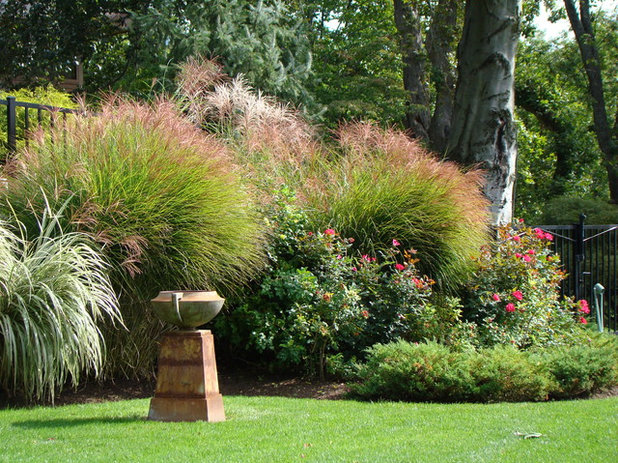
I'm a sucker for a well-placed piece of artwork or sculpture in a garden setting. This classical bowl on a substantial pedestal has the correct proportion within the space. It rests informally on the green carpet of turf and relates nicely (at about half the height) to the border of ornamental grasses behind it.
As for scale, there's something quite elegant about the appropriateness of this piece. I can certainly imagine a much taller sculpture placed here. But I do appreciate how the pedestal's volume echoes the tree trunk at the far right.
Erla Dögg ingjaldsdóttir
Is this from
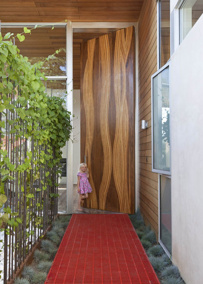
Alice in Wonderland? This gigantic door dwarfs the little girl standing in the doorway. It's an exaggerated illustration of scale and how we judge an object in relationship to an ideal or norm, such as the human body. Disproportion isn't always a negative, however. The overscale door and decorative surface pattern are stunning. From our vantage point, the door has a strong relationship with the bold red entry walk. Together the elements make an unforgettable impact.
Frank & Grossman Landscape Contractors, Inc.
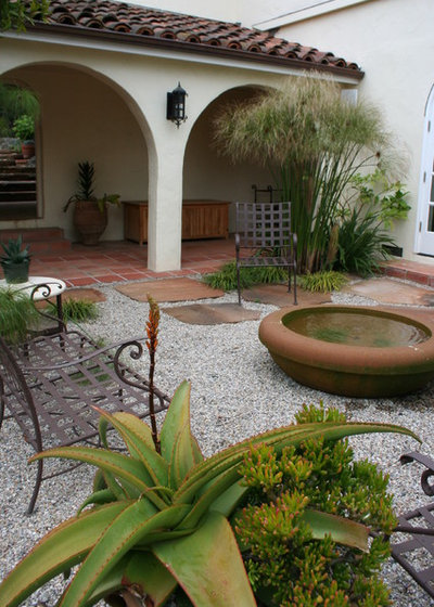
A single large-scale object always makes a bigger splash than a cluster of small objects. That's obvious here, where the saucer-shape water feature dominates (but doesn't overwhelm) this Spanish-style courtyard. Its dimensions are practically the same as the arches across the loggia, unifying the water feature with its surroundings.
Dig Your Garden Landscape Design
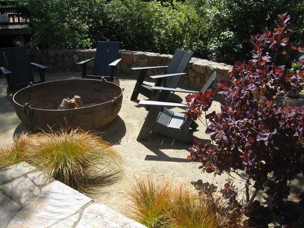
Similar to the previous water feature, this massive fire pit used as a central design element illustrates confident use of scale. Think about those flimsy, imported fire pits that constantly threaten to be knocked over. Instead, the owners of this inviting outdoor space have used an industrial metal salvage piece to create the aboveground fire pit.
There's a good understanding of proportion at play here, too. Notice how the space surrounding the fire pit accommodates comfortable Adirondack chairs and a curved retaining wall.
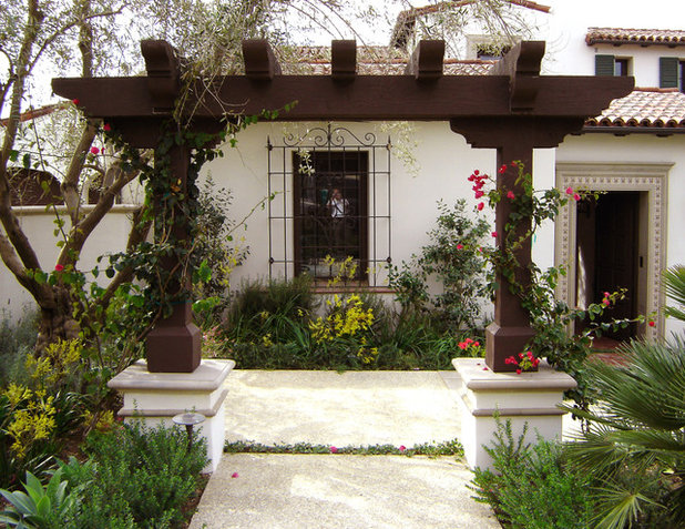
AMS Landscape Design Studios, Inc.
An arbor constructed from massive timbers frames the entry to a gravel courtyard. Here is a situation where the materials are proportionately accurate in relationship to the architecture. The scale is also appropriate — not too large, not too small.
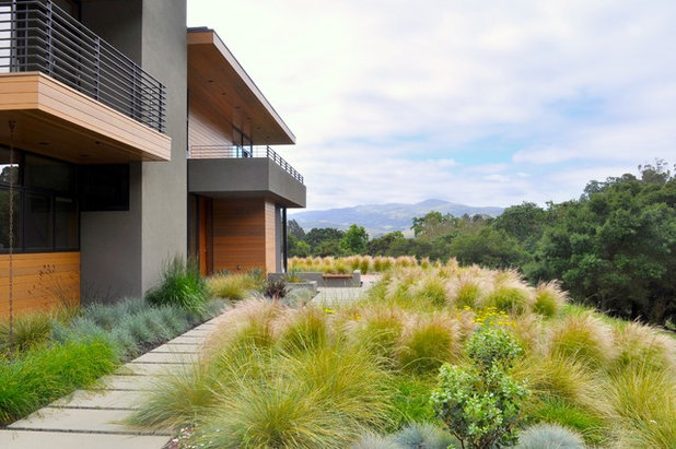
Huettl Landscape Architecture
The height of this home determines the depth of the landscape in front of it. The home's scale and the garden's scale feel related. The eye moves comfortably from the ground plane to the vertical plane, creating a harmonious effect.


