The idea of balance is deeply ingrained in our DNA. We humans couldn't walk without balance. We feel at peace when a scene is visually balanced; we are agitated when what we see appears out of balance. We almost instinctively know "good balance" when it is done well, but can we explain how and why a visually balanced environment, setting or scene moves us?
According to Marjorie Elliott Bevlin, author of
Design Through Discovery, balance is a basic characteristic of all art, and it is divided into three categories:
Asymmetrical, in which both halves of a scene may express the same visual weight but are positioned unevenly. Think of how a scale works or children playing on a seesaw. Balance is created by a shift in weight on both sides of a central fulcrum.
Symmetrical or
bilateral, in which both sides of a composition are equal. Think about the human body and most of the clothing we wear. One side is essentially a mirror of the opposite side.
Radial, in which balance emanates from a central core like the rays of a sunflower or spokes of a wheel. "It is perhaps the most dynamic type of balance, for it connotes explosive action," Bevlin writes.
Understanding balance allows us to decipher
why a designed landscape is successful or not. Here are some examples that caught my eye.
Natural Balance Home Builders
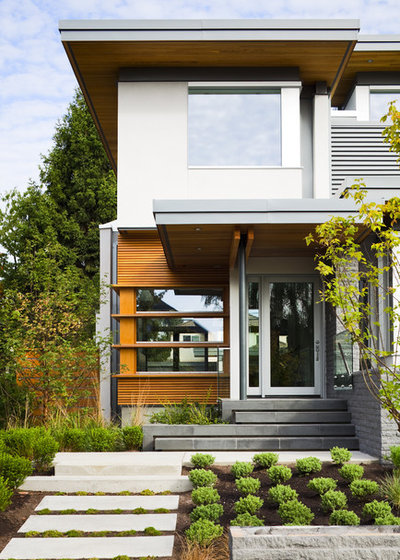
Asymmetrical BalanceA modern entry garden is balanced thanks to the clever use of lines, materials and plants. Notice how the graphic entry path creates a visual volume equal to the front door. And the color-block planting bed echoes the volume of the window. This is a thoughtfully designed space that uses geometry to create a playful balance of many parts.
Grounded - Richard Risner RLA, ASLA
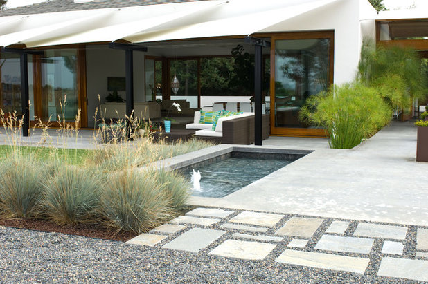
There are no symmetrical elements of this contemporary patio, yet the components feel balanced thanks to the rectilinear design "blocks" aligned both perpendicularly and horizontally with the home's facade. The stepping-stone "carpet" and the section of oat grasses balance nicely with the solid concrete patio and the pool. These elements and textures are all the more exciting because of the asymmetrical arrangement.
Lee Ann Marienthal Gardens
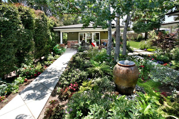
Asymmetrically aligned with the house, a long, narrow walkway is often the most difficult type of hardscape to work with. But here the designer takes advantage of the exaggerated space. A lush, densely planted shade bed more than balances the linear walk. The urn's presence lends importance to the setting and provides another nonplant element to the scene.
Studio William Hefner
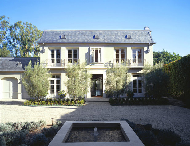
Symmetrical BalanceClassic but not dated, this French country–inspired residence relies on symmetrical balance. From the placement of the bubbling fountain in the auto court — aligned perfectly with the front door — to the four olive trees that are placed two per side, this is a picture-perfect example of good balance. The garage is attached at the left, of course, but it is visually balanced by the dense hedging to the right.
TEA2 Architects
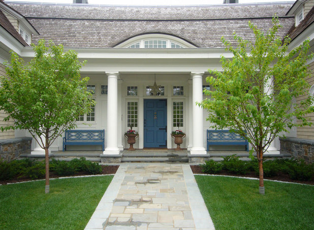
This elegant entry garden expresses symmetrical balance with both curved and straight lines. The walkway, front door, trees and columns are displayed in perfect alignment, making this space feel settled and secure. The gentle curve in the lawn repeats the eyebrow-shaped gable above the front door; together they lend a softening influence to the geometric space.
River Valley Orchids
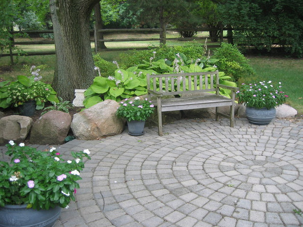
Radial BalanceRadial balance is seen here in a perfectly round cobblestone patio in a quiet shade garden. Think about how ordinary this space would appear with a traditional flagstone patio or a concrete slab. Using the radial design both energizes and enlivens the garden.
Huettl Landscape Architecture
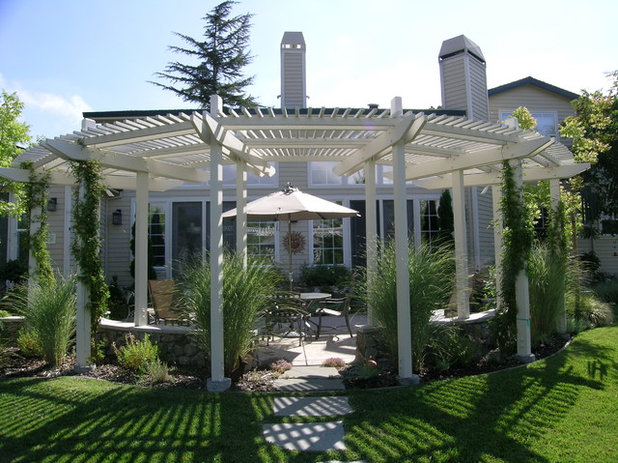
The slats of this circular arbor span outward like the framework of an open fan and create a dynamic architectural point of view. Perfectly situated in alignment with the home in the distance, the structure uses radial lines to add interest to a formal landscape.
debora carl landscape design
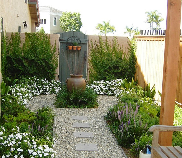
A Hybrid ApproachA private, semiformal courtyard illustrates symmetrical balance and a hint of radial balance. Aligned with the urn and the gate, a gravel path moves through the center of this garden, in balance with herbs on both sides. As the path reaches the small, circular focal point, it splits into two matching crescents; they continue around the urn and reconnect on the far side. Adding a circular detail to a straight path is a classic design trick that turns an otherwise ordinary space into something really special.
Heidi's Lifestyle Gardens
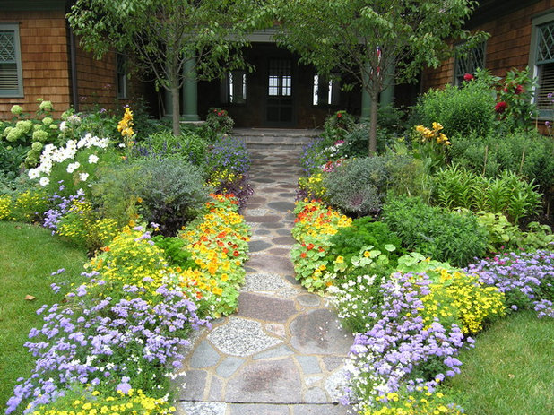
This abundant entry garden feels thoroughly in balance as the composition draws on elements that are both symmetrical and asymmetrical. The flagstone path creates a strong, straight axis to the home's front door. There are many plants that mirror each other on either side of it, including two shade trees that flank the path. But thanks to the freely flowing annuals and perennials that have minds of their own, nothing is too perfect or too matchy-matchy. And that's why we're charmed by this scene.
Jeffrey Gordon Smith Landscape Architecture
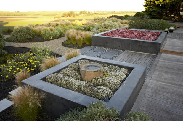
The pair of raised planters on either side of the wood corridor is a hybrid combining both symmetrical and asymmetrical aspects. They are certainly made from the same stone and feature the same square proportions. But there are different textures, shapes and colors of vegetation in each planter, infusing a touch of asymmetrical balance into the design.
More:A Fine Balance Makes the Space


