"A work devoid of a unifying element is liable to seem haphazard and chaotic. A work that is totally unified, with no variety, can seem boring. These two principles are interlocked," writes Marjorie Elliott Bevlin in
Design Through Discovery, a college art theory book that I've never tossed out, thanks to its timeless instruction. Together, unity and variety can turn an ordinary space into something extraordinary.
Unity represents the control of variety, and variety provides the interest within unity. The ideal result balances the two. These two guiding principles can apply to so many aspects of architecture, interior design and the landscape.
Here are some excellent examples of the subtle but powerful balance of unity and variety, used in outdoor settings.
More garden design elements: Line | Rhythm | Shape and Mass | Space | Texture | Color
Bosworth Hoedemaker
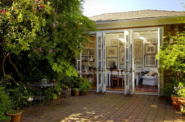
UnityThe interior wall of this beautiful garden room is hung, gallery-style, with vintage maps. Not one is alike (variety), but with similar off-white matte boards and dark frames, the overall composition has unity.
Similarly, there is continuity between the blonde wood floor and chairs, as well as the armchair's white slipcover and the white parson's tables.
Studio Marcelo Brito
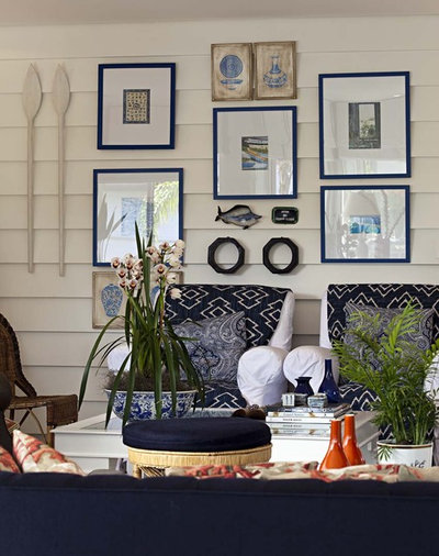
Blue, white and nautical themes unify this attractive vignette on a covered porch. The variety
is expressed by three-dimensional nonframed objects, including the paddles, the fish and other discoveries from the sea. Their presence makes the grouping of framed prints all the more interesting.
Rama
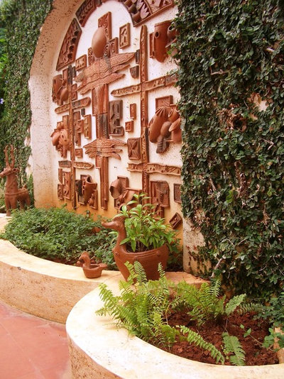
A study in terra-cotta illustrates how harmony of material can be a unifying device. This three-dimensional mural utilizes a diverse assemblege of shapes and forms (variety). Because each piece is made from the same type of clay, there's an overall feeling of unity.
Carson Poetzl, Inc.
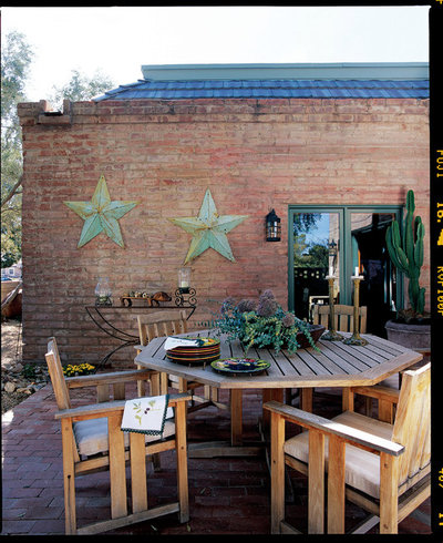
Unity can also be established with color. Verdigris green in a variety of applications holds things together in this patio of mostly neutral and natural surfaces. The two oversize stars echo the door trim, which in turn echoes the planted succulents on the tabletop and the potted cactus.
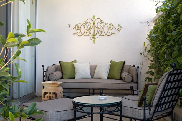
Elizabeth Dinkel
Subtle yet satisfying, this outdoor seating area incorporates
unifying details such as color: The wrought iron furniture and the upholstery's piping are both black; the olive pillows reflect the bay-green iron scrollwork. There is enough variety between materials, colors, textures and patterns, yet they speak a common, harmonious language.
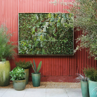
Bright Green
A planted canvas of succulents, designed by Flora Grubb Gardens in San Francisco, is framed as fine art. The many types of succulents, in shades ranging from blue-green to dark green to lime green, exemplify both unity and variety. Textures also contribute to the design's variety — and the overall composition is glorious.
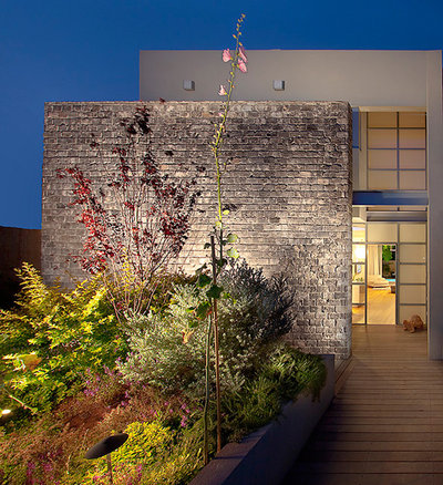
Elad Gonen
VarietyVariety of materials is perhaps the first thing you notice upon approaching this home. Although their color palette is similar, there's lots of contrast between the mortared stone privacy wall and the smooth exterior stucco. But notice how the sense of unity is expressed via warm, neutral finishes and a connection between the horizontal lines of the window grids and the horizontally cut stone blocks.
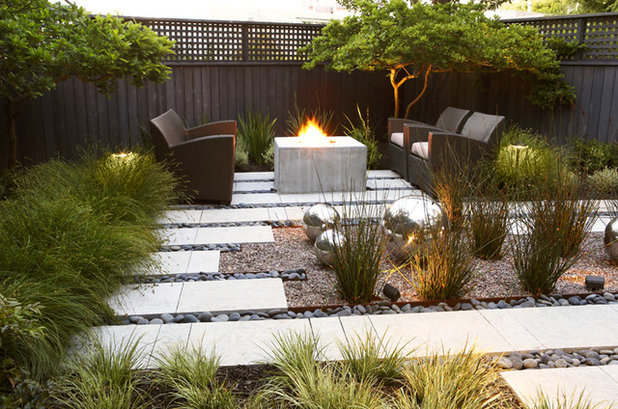
Arterra Landscape Architects
The idea of contrast is expressed in this attractive outdoor living room. The smooth bands of poured-in-place concrete contrast nicely with the surrounding pebble and gravel mulch and the trio of reflective orbs. There is unity in the palette: The chocolate-brown furniture reflects the similarly dark fence; the plants are mostly green and grassy. The overall mood here is serenity and harmony.


