Anyone who has walked into a room painted in a dull or garish palette knows the power of color. Color intuitively influences our emotions, whether we’re in a soothing spa environment or an electrifying casino. In a garden landscape, color plays an equally powerful role.
Our color choices can create a garden that is nurturing, romantic, playful, tranquil or exciting. Although you may have heard strict rules from other gardeners, such as "Never plant anything orange," or "Don’t use blue, purple or red shades in your garden's bed and borders," I like to think that any color can fit in a landscape.
Color is highly subjective, and since it’s so personal, you can design, plant and decorate your landscape with your favorites. Let’s follow the rainbow — and lessons from the color wheel — to make color choices that establish a mood, infuse energy or define a theme in an outdoor setting. Perhaps you’ll see new possibilities for your landscape.
More in this garden design series: Lines | Rhythm | Shape and Mass | Space | Texture
Da Vida Pools, LLC, Andre Del Re & Lisa North, CBP
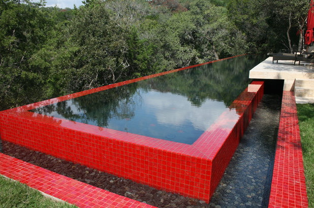
RedVivid red commands attention. You can’t ignore this assertive red pool — it punches up a natural landscape setting and dramatically defines the space. The surrounding retaining wall is a milder shade.
Ana Williamson Architect
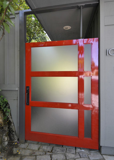
Interior designers have traditionally energized a quiet room with a splash of red — an accent pillow, a piece of pottery or even a single wall. In a similar way, the exterior of this contemporary but neutral house gets a lift with a cherry-red front door.
Classic Nursery & Landscape Co. / Alan Burke, asla
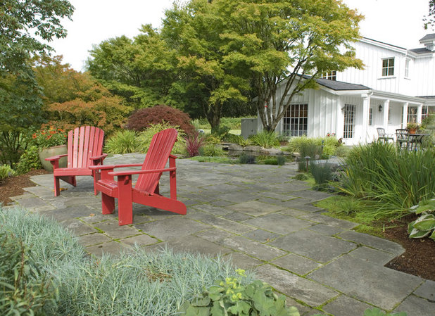
The use of red in small doses gives the garden a dynamic attitude. If pure red is a bit too intense for your taste, try a tint (lighter) or shade (darker). Extend your use of red from soft pinks to deep burgundy reds. These terra-cotta-red Adirondack chairs are eye catching but don't compete with the natural landscape.
Shirley Bovshow
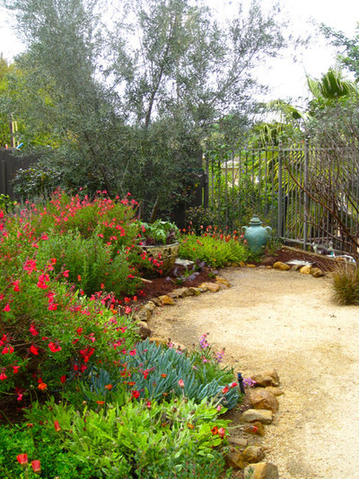
Just past this garden's entry is a blaze of red flowering salvia planted in a crescent bed to emphasize the space. Blue-green and turquoise — complementary hues across the color wheel from red — show up in a glazed urn and in the succulent plantings to the right of the red border.
Jeffrey Gordon Smith Landscape Architecture
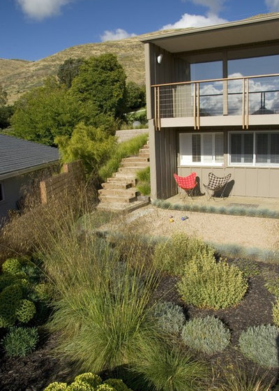
A little color goes a long way. Our brains respond more quickly to red than any other color, so even a small accent can energize a setting, such as the single red butterfly chair on this small covered veranda.
 Orange
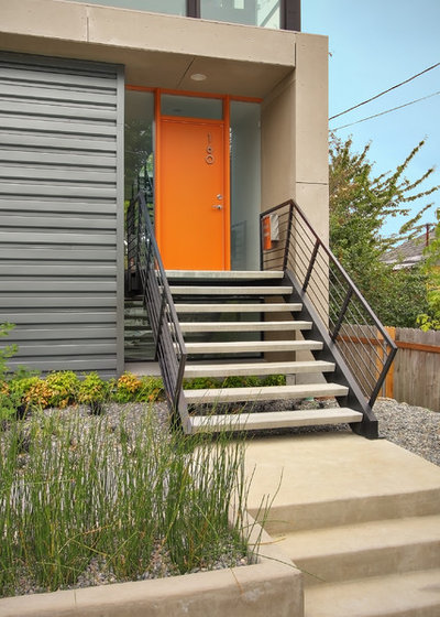
Orange is an essential accent in the garden; its presence naturally elicits a smile. This orange door is welcoming and also lends a moderating touch of warmth to the industrial charcoal and concrete palette.
Shades Of Green Landscape Architecture
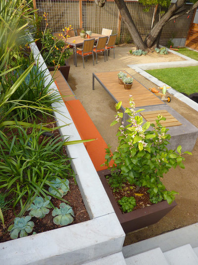
Tangerine touches add whimsy here, but this landscape is also quite sophisticated. Less is more with orange, and the designer perfectly balances the bright orange textiles, natural wood furniture and raised beds filled with foliage plants. Variations of orange range from terra-cotta to peach to coral; you don't have to use a hypnotic orange on its own.
Jeffrey Gordon Smith Landscape Architecture
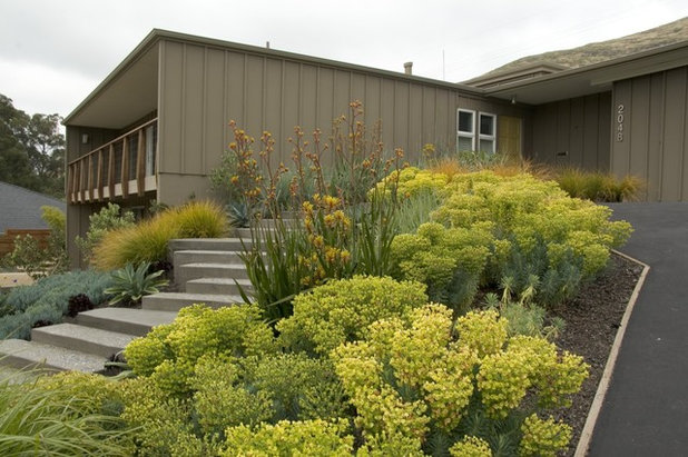
YellowGolden foliage can instantly brighten a space and make a small garden appear larger. Variations of yellow range from warm amber hues to intense sunflower. This design also demonstrates a monochromatic approach to color. In your own garden, monochromatic might mean blooms, berries or bark in one key color of the rainbow, such as an all-pink or all-golden border. Monochromatic color includes all tones of one color, from dark to light.
Related: Focus Your Garden Palette
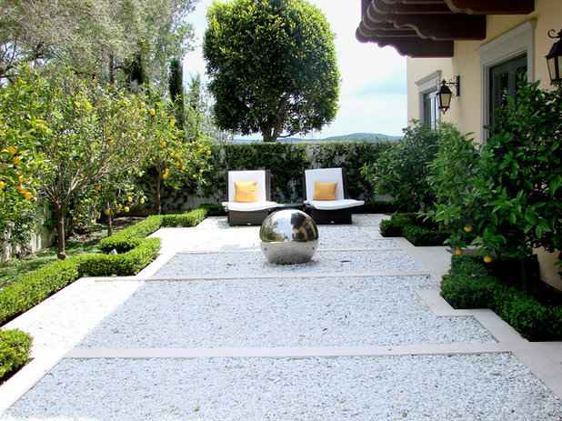
AMS Landscape Design Studios, Inc.
The simple addition of two marigold-yellow accent pillows makes a contemporary green and gravel garden glow.
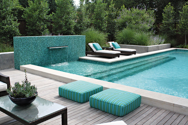
Bonick Landscaping
BlueAlthough it's calming and peaceful, blue was once considered an unattainable garden color since it's rarely found in nature (consider the pursuit of the rare blue Himalayan poppy or the rose industry’s obsession with breeding a blue hybrid tea).
The compelling presence of blue can appear in your garden with help from a can of periwinkle paint, a turquoise-tile pool or aqua cushions.
Blue cools us down. If you don’t have a swimming pool to bring the serene presence of blue into the landscape, paint the inside of a birdbath, display a grouping of glazed blue pottery, or lay a path with blue tiles.
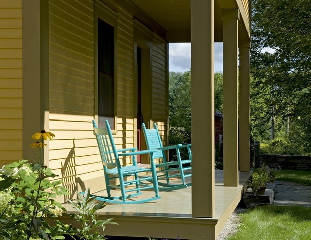
Smith & Vansant Architects PC
Once you’ve given certain flower and foliage colors a starring role in the landscape, use them to guide your decisions for nonplant materials as well. Edit and enhance the palette with painted structures, furniture and artful objects. Two sky-blue rocking chairs make this front porch just as important to the garden’s color story as its blooms.
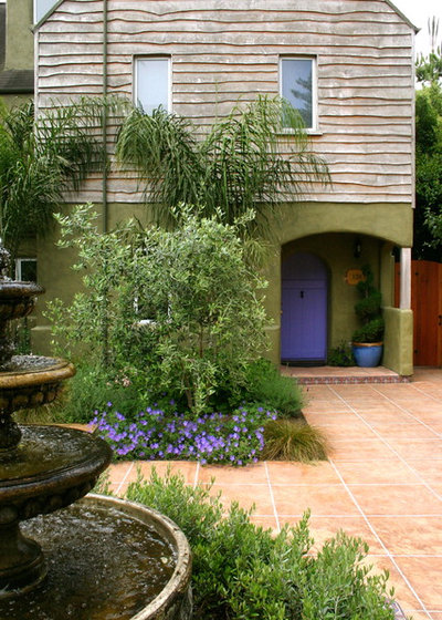
Kathleen Shaeffer Design, Exterior Spaces
VioletI love the way this setting reads: It begins with a small cluster of purple flowers (looks like
Geranium 'Rozanne') and then continues to the purple front door and accent pot. A triple-treat! Some of our most beloved garden flowers, such as lilacs and hydrangeas, are purple. But purple is not just an old-fashioned, nostalgic color. It can be quite modern in its application. Color experts say that because it is a mix of both energizing red and calming blue, purple is a complex color that works well with both warm and cool schemes.
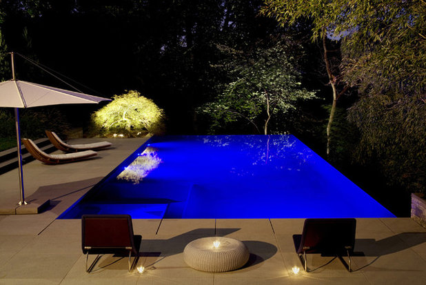
Lewis Aquatech
Basic Rules of the Color WheelArt lessons begin with the basic rules of the color wheel. Red, blue and yellow are
primary colors, while
secondary colors are made of combinations of two primaries: orange (red plus yellow); green (blue plus yellow) and purple (red plus blue).
Tertiary colors combine one primary color with one secondary color.
Adding white to a color creates a tint; adding black to a color creates a shade.
The primary palette of the vivid blue pool shown has another primary accent in the yellow-chartreuse Japanese maple tree, uplit for emphasis.
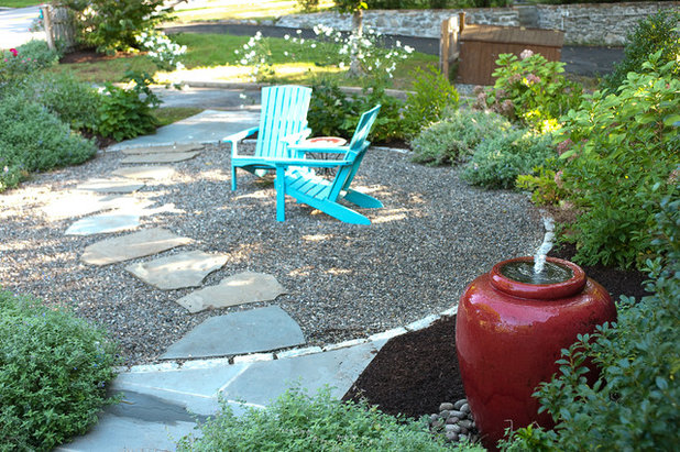
Westover Landscape Design, Inc.
Enliven a quiet spot with complementary colors opposite each other on the color wheel. In color theory, opposites are energy-packed visual experiences. Red is opposite green; blue is opposite orange; yellow is opposite purple. In the landscape, red and green are opposites, but the use of turquoise rather than true green bends the rules while still making a vivid statement. The horticultural equivalent might be a plant with lime foliage paired with a maroon or wine-color plant.
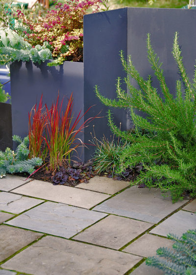
Exteriorscapes llc
The medium-tone purple wall is an interesting backdrop to the Japanese blood grass (
Imperata cylindrica 'Rubra') planted in front of it, showing use of tertiary color.
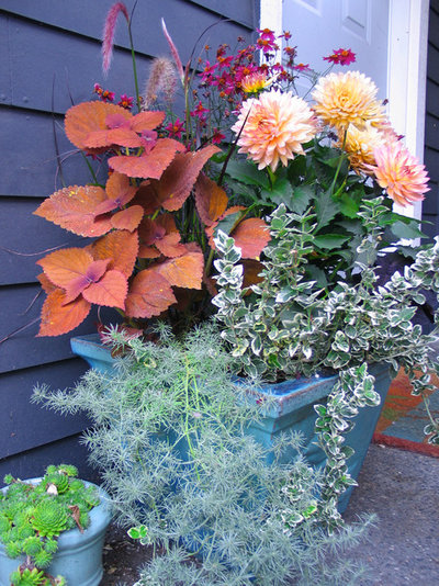
Exteriorscapes llc
Tell Your Own Color Story Define your garden with massed plantings of a favorite perennial to echo colors that appear elsewhere (both in your own garden and from borrowed views).
You can keep the color palette more intense in certain spots, allowing dominant shades to define a focal point or announce a transition area in the landscape. Muted tones help the eye move calmly between the bolder elements, providing a restful visual pause.
This container is a study in complements, with a cinnamon-color coleus and peach dahlia occupying the warm end of the spectrum and the turquoise glazed pot and trailing foliage providing the cooler notes on the scale.
S / Wiley Interior Photography
Find Your Color StyleWe can learn volumes about color through observation and experience. When you visit a public garden, shop at local nurseries or take a tour here on Houzz, notice which colors please your eyes.
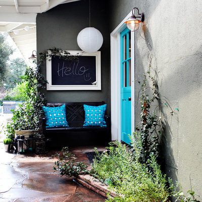
It is clear that Tiffany blue makes the owner of this cottage very happy. That's the power of color.
More:The Stories Colors Tell
Potted Plants Perk Up the Streets of Coastal France


