Space, a critical element of design, is ever present in the outdoor world, thanks to the vast sky overhead, the seemingly endless horizon of the ocean or a distant view of treetops.
We can take advantage of the greater environment in our landscapes, but how we play with space can greatly enhance a garden or patio on a human scale. It all depends on how we see a scene and notice dominant two- or three-dimensional forms and the surrounding space that frames them.
This phenomenon is known as "figure-ground ambiguity" — you alternately observe the positive figure and then the negative ground as its silhouette. Together, the figure and ground assume a pattern of their own.
There are literal ways to express this, such as with a symmetrical, black and white tile pattern. And there are also figurative ways to convey this idea, with an eye-pleasing balance of solid and amorphous elements in the landscape,
Here are several great ideas for emphasizing the landscape's positive and negative visual balance.
More in this garden design series: Using Lines | Using Rhythm | Using Texture | Using Shape and Mass
Arthur Dyson Architects
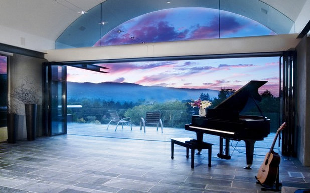
What can I say other than "wow!" When the doors of this beautiful room are opened, it's almost as if the entire universe becomes part of the space. The designer gets major kudos for orienting the home toward the breathtaking sunset view and for capturing that dreamy world as a backdrop to the distinct lines of the built environment. Even the large crescent-shape clerestory window reads as a positive-negative pattern to this design.
Griffin Enright Architects
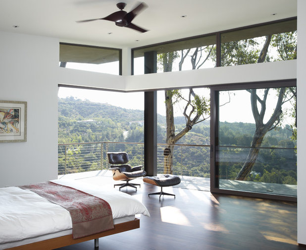
The same idea of borrowing the distant view is seen here, as this design relies on a lush, verdant canyon and the architectural framework of trees to define positive-negative space. The bedroom walls and transom windows serve as static foreground shapes, while nature beyond is ever changing with the seasons.
R.J. Gurley Construction
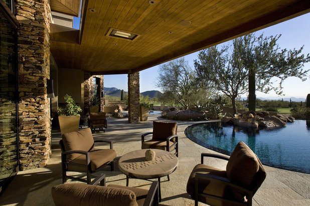
A deeply covered desert patio is the dominant form in this landscape, its stone pillars echoing the bold tree trunks and cacti at the edge of the pool. I like how the curved pool intersects the patio, its distinct edge suggesting an almost yin-yang pattern. Sometimes this pool is the positive form, but depending on the time of day and the position of the sun, it can also read as the negative form.
John Maniscalco Architecture
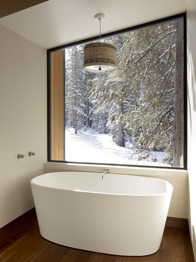
A simple, serene window looks out on a private world. The solid volume of the soaking tub is evenly matched by the natural drama outdoors. Together they create one scene, cohesive and compelling.
Stelle Lomont Rouhani Architects
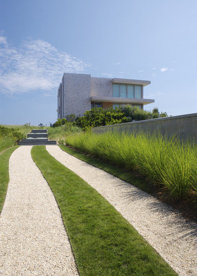
There is a distinct positive-negative pattern in this oceanfront property. The home itself is a dominant object on the horizon, yet this long grass-and-crushed-rock driveway reads as a similarly bold presence. A continuous border of ornamental grasses plays an important role to downplay the tension between the commanding architecture and the strong lines of the driveway.
Windsor Companies
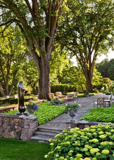
Two beautiful, multitrunked shade trees gain prominence in this garden, thanks to the way the bluestone patio has been situated to emphasize their inherent elegance. Patios almost always read as the positive, more dominant form in a landscape, but here, the patio is a backdrop to the trees. The entire scene reads as harmonious and balanced, and I think it is because the patio's generous scale feels like a theatrical stage, with the trees as star performers.
{environmental concept}
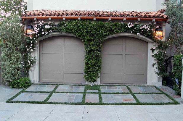
Sometimes just outlining one shape helps to create yet another shape. In this small auto court, the simple idea of planting a 2-inch ground cover grid around the pavers illustrates the positive-negative pattern. And similarly, by planting a lush Cecile Brunner climbing rose around the two arched garage doors, yet another attractive positive-negative form is created.
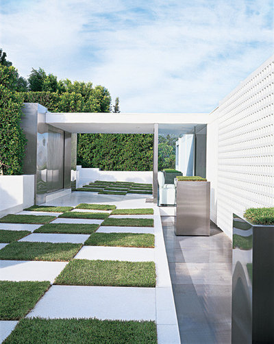
I couldn't talk about positive-negative spaces without showing you at least one checkerboard. It's a favorite design theme, and here it is quite successful. Imagine this veranda planted with only grass or paved with only concrete. Neither solution would be as effective as this one, where a functional walkway becomes a work of art. Another reason this design works so well is that the bold squares are in proportion to the architecture. There's nothing tiny here.
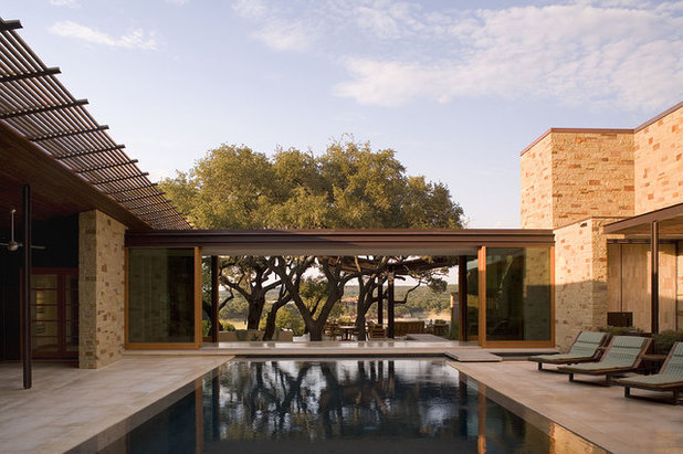
Dick Clark + Associates
Everything the eye sees here is in perfect harmony with the larger environment. The courtyard pool lines up with the breezeway to frame a rugged stand of desert trees; together they draw your attention to the vast sky. The negative spaces — sky, trees and distant hills — are as important as the positive ones — home, pool and breezeway.
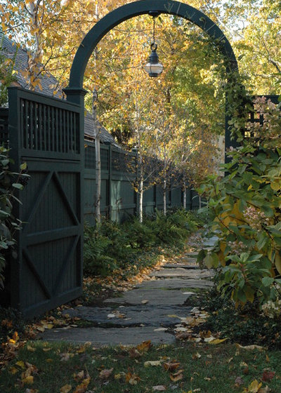
Timothy Lee landscape design
Portals, thresholds and doorways often define a garden space. Here, the lovely curved arbor over a garden gate reads as the positive form in the side garden. It's balanced by the solid stepping stones that will lead you farther into this softly planted environment.
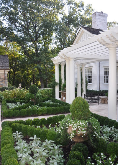
Deborah Cerbone Associates, Inc.
Formal knot gardens and parterre-style designs allow for the horticultural play of positive-negative forms. We first notice the dark green boxwood X-shape design of the two formal beds. Then, the silvery white contrasting elements (in the triangular sections) catch the eye. Which section is the positive form and which is the negative? You need both to complete the design.
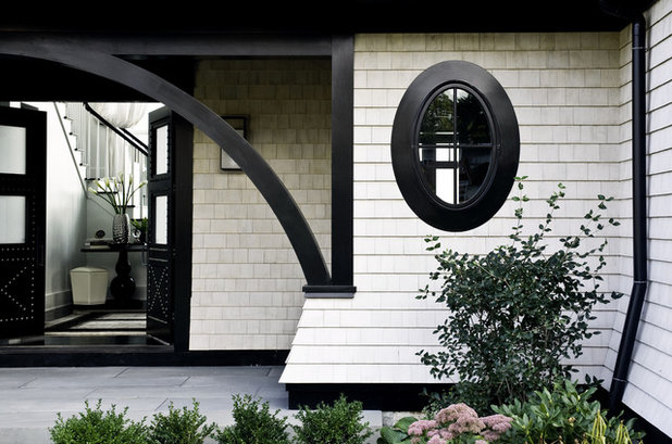
LDa Architecture & Interiors
Like planting outlines of ground cover in a patio or training vines to frame a window or door, the color you choose for a home's exterior trim can dramatically alter its appearance for the better. The use of glossy black to emphasize the beautiful millwork and oval window on this home is inspired. Consider how to use the positive-negative shapes of your architecture to create a similar effect.
More:Old-School Design: Frame Your Garden View


