I'm reviewing the elements and principles of design — straight out of my 1980s college textbook
Design Through Discovery, by Marjorie Elliott Bevlin — as they relate to gardens. I wanted to explore my own understanding of these classic design themes and find projects to illustrate each one.
It turns out that shape and mass are interrelated concepts, elements that refer to how we view forms in the environment. Think about shape as a two-dimensional form and mass as its three-dimensional iteration. Bevlin illustrates shape with a line drawing of a square. Turn that square into a cube and the idea of mass appears.
In the landscape, we can use both shape and mass to define spaces and give us clues as to how to occupy or navigate through them. The eye may see shapes as patterns, such as in a floor, wall or surface design. And similarly, the eye sees geometric, natural or multidimensional forms as mass.
Here are some great images to help us understand how to use shape and mass in the landscape.
More in this garden design series: Using Lines | Using Rhythm | Using Texture
House + House Architects
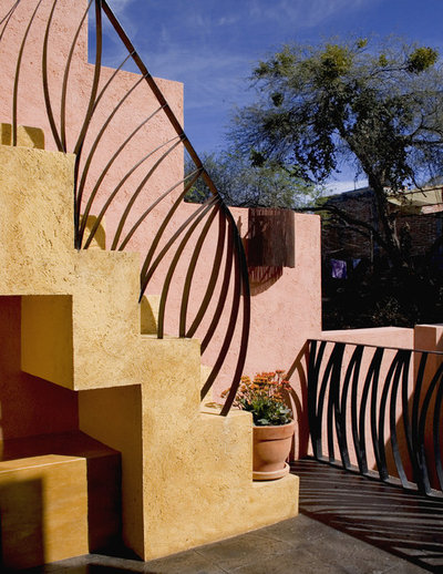
The organic, curved lines of this staircase railing and balcony screen infuse the space with drama. While used for functional purposes — safety and navigation — the bent metal forms have a pleasing sculptural quality. I appreciate the open and transparent design, which makes the metalwork less imposing.
The Collins Group/JDP Design
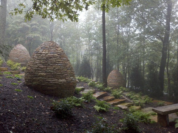
There is no question that these three rock formations add mass to this meditation garden. Clearly, these pieces are man-made, but because they were built from native stone rather than from metal or fiberglass, they fit into the space quite naturally. Moreover, they seem to have a calming, timeless presence here, suggesting protection. The visual stone mass strikes a balance with a different mass from the slender tree trunks.
Feldman Architecture, Inc.
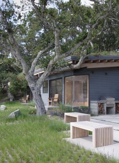
Simple benches, formed by a series of linear wood shapes, provide seating as well as dimensional interest at this patio's edge.
Andrew Renn
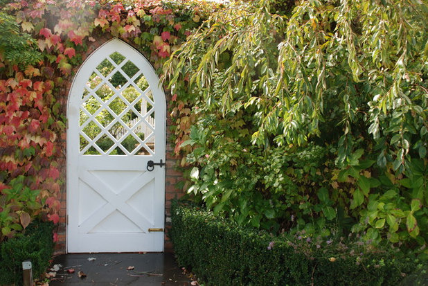
Some shapes are so distinctly associated with a design style that they become iconic. You'd assume that this arched door in a garden wall was built to complement a Tudor-style cottage, for example. The diamond-pattern lattice in the door's upper portion is echoed by X-shaped bracing on the lower portion of the door. Utterly charming.
Arterra Landscape Architects
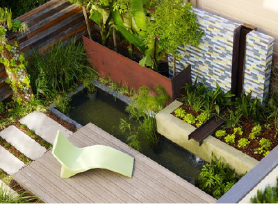
A bird's-eye view of an intimate courtyard garden allows us to see where shapes and masses interrelate with perfect harmony. First you notice the rectangular stepping stones and deck shapes, then the three-dimensional versions emerge in the Cor-Ten planter box (left) and the poured-concrete planter (right). The decorative fountain wall infuses another mass into the scheme. While this environment is small in scale, it feels voluminous. Add one more shape: the curved chaise, a graceful footnote to all the geometry here.
Ron Herman Landscape Architect
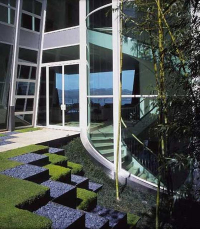
A checkerboard-style installation has the feeling of a Tetris video game. Made with two different materials — soft, green turf and slate-colored stone — these stacked cubes framed in weathered steel bring energy and interest to the courtyard. They illustrate how easily a simple square can become a three-dimensional massed form. There are two more factors to this design: shadow and light, depending on the time of day and your vantage point.
Studio Zerbey Architecture + Design
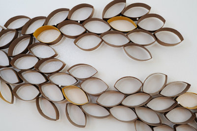
This leafy-style artwork is made from cardboard toilet paper tubes for an interior space. I added it to this ideabook, though, because it so nicely illustrates how interest and volume are created by repeating simple lines. The genius of this design is one strong, leaf-inspired form. Multiplied as a mass, it transforms into something suggestive of a verdant tree branch.
Bright Green
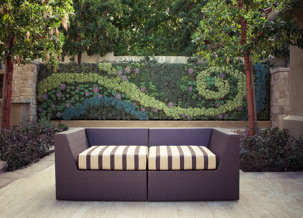
This outdoor room is stunning, thanks to the clever way that shapes and mass are used. The planted wall has a dominant spiral shape that you can't help but notice. In the foreground, the mass is created by the modern seating as well as by the symmetrical planting beds and trees.
Windsor Companies
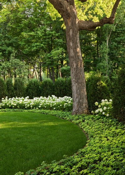
While the ingredients are quite traditional — a lawn, ground cover, flowering shrubs and a specimen tree — this design utilizes shape quite well. The overall look is sophisticated, beginning with the strong, rounded lawn and continuing to the curved planting bands that emanate from it, all the way to the arborvitae hedge, which provides mass at the perimeter of this lovely, green garden.
More:Garden Sculptures Shape the Landscape


