If you’re like me, you’re a strong believer that plants are meant to be enjoyed indoors as much as out. Many of us might be holed up over winter or don’t have the space to tend a garden outdoors, so let’s focus on bringing the garden in.
By applying a mix of the principles and elements used for outdoor plant design, including thoughtful placement and attention to form, texture, color and proportion, you can easily create an invigorating indoor landscape with houseplants, whether you have only a windowsill to work with or an entire light-filled room.
Lasley Brahaney Architecture + Construction
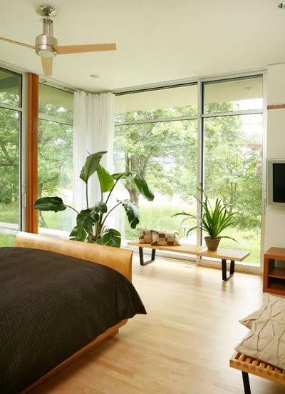
1. Proportion: It’s all about scale. Take in the size of your room before you head to the nursery. Choose a plant that fits not only the size of the room but where it’s being placed. An excessively large plant can overwhelm a space, while a tiny plant can appear insignificant if placed out of context. The bird-of-paradise in this image appears at home in the room, with its high ceiling and large windows.
Tip: Choose a plant that relates to any plants growing just outside the windows for a cohesive look that helps create a connection to the outdoors.
Hey Nice Garden
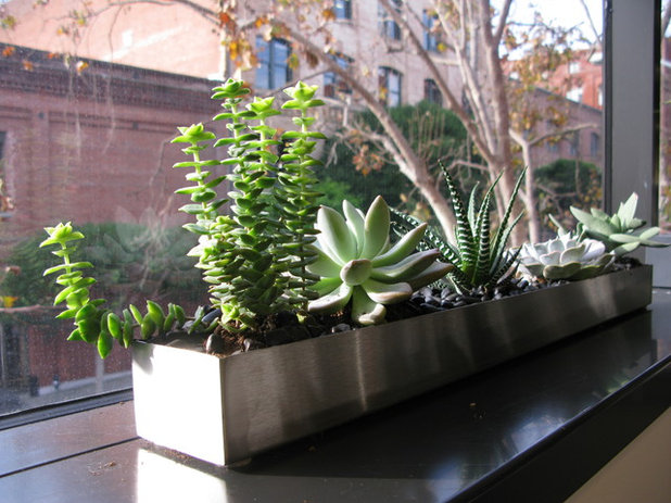
For a windowsill garden, try a single narrow planter that can hold several small plants (in this case succulents) or a row of small pots at varying heights.
Tip: Use a planter or container that captures the water that flows through the drain hole at the base to prevent damage to your windowsill.
Garden Design Essentials: Proportion and Scale
Bon Vivant
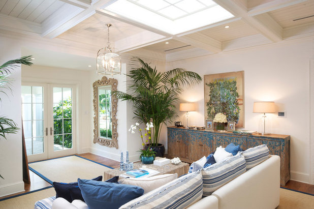
2. Form: The three-dimensional shape of the plant. Take into consideration the shape of the plant and how that shape fills the space. Examples of different plant forms include weeping, columnar, round, pyramidal and vase shaped.
Tip: Consider the ceiling plane that a plant can create. Here a vase-shaped palm gently arches over a sideboard in the corner.
Garden Design Essentials: Shape and Mass
maja_krajewska
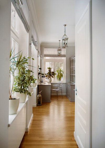
3. Texture: How coarse or fine the plant’s surface looks or feels. Think strappy, fuzzy, spiky or bold and how that texture provides contrast and interest. If you have a long panel of windows, try mixing different foliage textures to help create an interesting passage through the space.
Tip: Use pots that are all the same color to help play up the different foliage types.
Garden Design Essentials: Texture
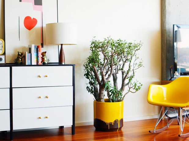
Dabito
4. Color: Can be a landscape’s most conspicuous element. Color has the power to pull a landscape together or throw it into chaos. The same holds true for indoor plants and the vessels we put them in. If you’re not afraid of color — and there’s no need to be — choose a bold shade that echoes a color found elsewhere in the room. In this case the mustard-colored pot echoes the color of the nearby chair.
Garden Design Essentials: Color
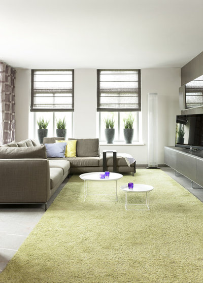
HUISSTYLING
5. Repetition: The repeated use of elements (plants) to create a pattern or sequence. Applying repetition with respect to houseplants is greatly dictated by a person’s individual aesthetic. If your tastes lean toward modern, try filling a windowsill with a row of identical plants for a clean, simple look.
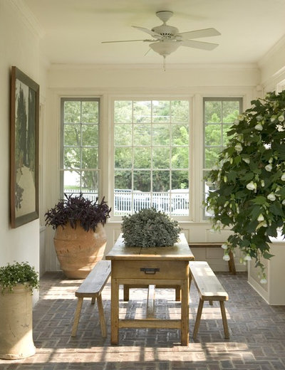
Dennison and Dampier Interior Design
If you’re not interested in using the same plant multiple times, you can use plants with a similar form (in this case round) but in varying sizes and textures. It’s less obvious but achieves a similarly pleasing effect.
Teach Your Landscape Rhythm
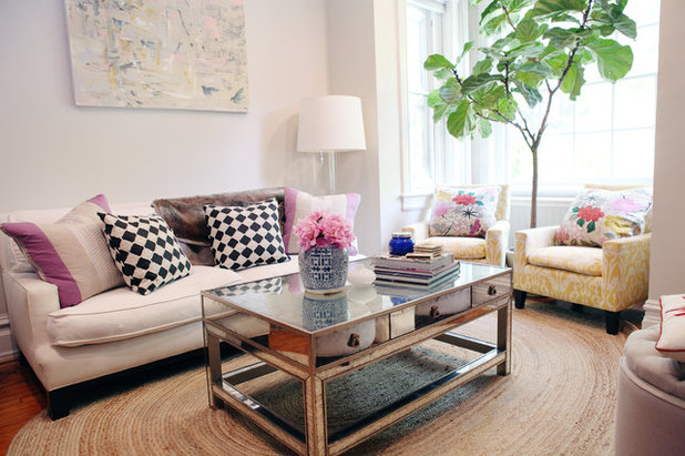 6. Focal point: A plant that demands attention due to its size, color, texture etc.
 If you have an area of the room that you want to designate as special, in this case a cozy corner with two chairs, try placing a large specimen plant, such as a fiddle leaf fig (
ficus lyrata), nearby to draw the viewer in.
Tip: A large indoor tree will most likely need lots of natural light. Place the tree near a south-facing window if possible.
Garden Design Essentials: Emphasis and Focal Points
Kristina Wolf Design
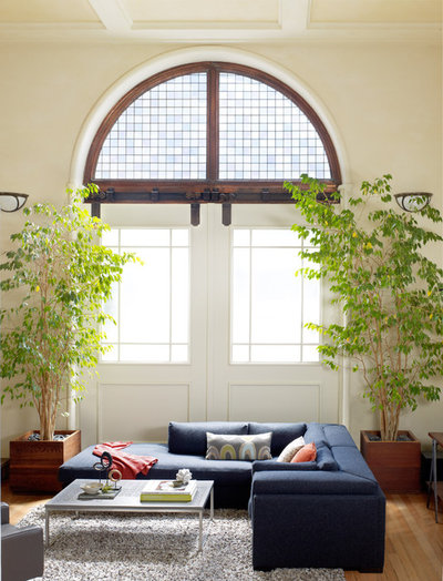
7. Balance: Equal plant material on either side of a centerline. Doors and windows present the perfect opportunity for symmetrical plant placement. Identical plants flanking a doorway act not only as a frame for the door but as a link to outside. However, just because a design is asymmetrical doesn’t mean it’s not balanced. For a more informal or relaxed look, place plants of various sizes on either side of that imaginary centerline. As long as you have approximately the same total plant mass and visual weight on each side, you’re good!
Tip: Size and shape play an important role here too. A grand entry can accommodate large plants.
Garden Design Essentials: Balance
Joseph Bergin Architect PC
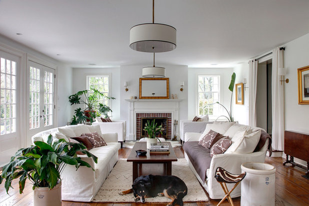
Taking into consideration everything we’ve just discussed, try interspersing plants of varying heights, textures and colors throughout a room. Green accents in different places will tie the room together. Tall over here; bold over there — you can do it.
More:8 Essentials for Healthy Indoor Plants
More Houzz guides to growing houseplants


